Article
Five selected features of the 2302 upgrade of SAP IBP

Article
Read more
7 March 2023
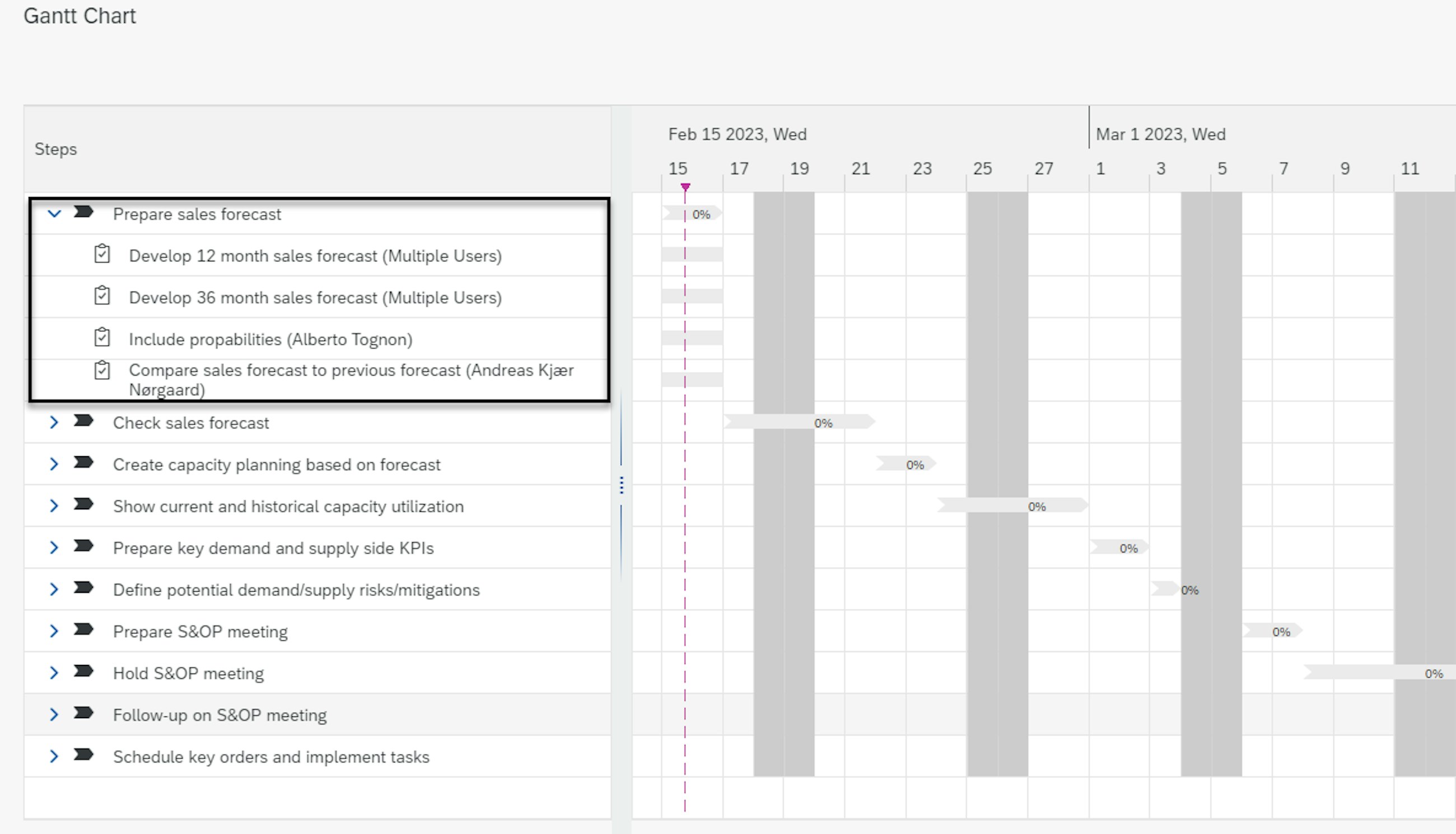
In the 2302 release of SAP IBP, several enhancements have been implemented to improve the usability of the process management apps. These updates include changes to the user interface, such as the ability to view group tasks in a single line in the overview Gantt chart and the use of the term “Multiple Users” when there are several assignees to a task. These modifications make it easier for users to understand the status of tasks and assignments quickly without flooding the Gantt chart. Previously, a line would have been created for each assignee to the task.
Additionally, there has been an expansion of the collaboration features to improve the usability of the Manage Tasks app. Users can now filter tasks by collaboration group on the “Tasks Assigned to Me” as well as “Tasks Assigned by Me” tab pages, provided that the system is enabled for collaboration. The drop-down list of the collaboration group filter displays all the collaboration groups to which the user belongs, along with the tasks that they have assigned to others or that are assigned to them.
Another enhancement to the user experience in the Manage Process Templates app is the integration of the task creation dialogue from the Manage Tasks app into the Manage Process Templates app. This integration allows users to create tasks in the same way they would in the Manage Tasks app, directly from the New Process Template view when creating a step. By reusing the task creation dialogue, this feature streamlines the task creation process, simplifies the user experience and ensures consistency across task creation in different apps.
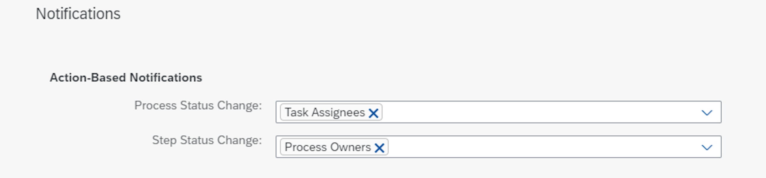
The Manage Process Templates app now includes the ability to set up notifications, which are displayed in the Manage Processes app. Users can configure notifications for process and process step owners, step participants, task assignees or a combination of these on the Notifications tab in the Manage Process Templates app. Notifications are triggered as soon as there are changes to the process or process steps and are displayed in the SAP Fiori Launchpad notifications area. In addition to being displayed, notifications can also be sent as an email. This feature allows for greater communication and transparency throughout the process, ensuring that all relevant stakeholders are kept up to date on relevant process changes.
To further enhance collaboration, there is now an option to use Microsoft Teams as a collaboration tool for managing group tasks. This alternative is available alongside the previously available collaboration tools of SAP Jam and SAP Build Work Zone. If Microsoft Teams is enabled as the collaboration tool for group tasks, it only affects the process management apps. Other apps that use a collaboration tool will continue to use the one that has already been set up. The addition of Microsoft Teams provides users with a new option for collaboration that may better suit their needs and preferences.
For the 2302 release, SAP has enabled multiple functionalities in the inventory optimisation models. All these new features have also increased the usability of the Inventory Analysis and Inventory Profiles apps. Let’s take a closer look together at what is now possible to do.
Some of the highlights from the application, which are explored here, include:
Enhanced usability in Inventory Profiles app
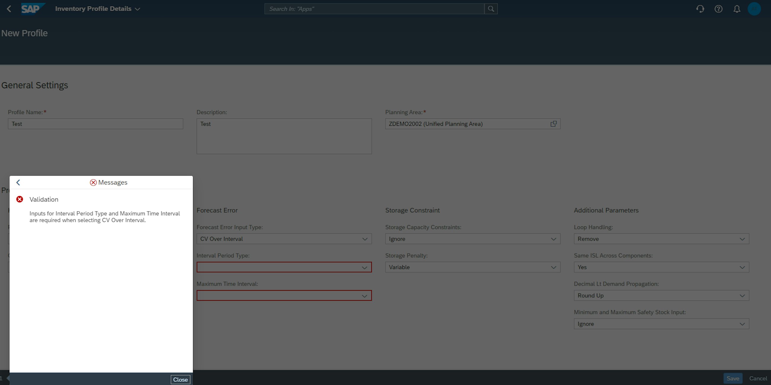
The Inventory Profiles app enables you to create inventory profiles that can be used to run inventory optimisation planning operators. You can use your inventory profiles in the Application Jobs app and the SAP Integrated Business Planning, add-in for Microsoft Excel. With the new release, there has been a small yet important improvement that enhances the usability in the Inventory Profile app.
In fact, if a user now enters invalid information or does not enter required information when creating an inventory profile, an error message will be displayed as shown in the picture below.
The error message indicates the fields that are not filled in and that are mandatory to create a new inventory profile.
The mandatory fields are the following ones:
To create your inventory profile, complete all required information and correct any invalid entries.
Simplified scenario naming in Inventory Analysis app
With the latest release, there has been a change to simplify how scenarios are identified in the Inventory Analysis app. In fact, previously, it was possible to name scenarios with the same name. This has led to confusion and the risk of picking someone else’s scenario if the names were the same. The Inventory Analysis app now requires you to use a unique name for each inventory analysis that you create.
If you duplicate a name that is already in use, an error message displays when you create your analysis. To finish creating, you must use a different name. You cannot edit or change this name after you have created your analysis.
It is important to mention that this update applies to analyses created after release 2302. You are not required to retroactively change the names of scenarios that you have already created.
New multi-stage network operator
SAP Integrated Business Planning for inventory offers inventory optimisation and inventory component planning operators. You can now use the multi-stage network operator to visualise multi-stage networks that are subject to optimisation before you run inventory optimisation and apply attribute-based filters.
You use the multi-stage network operator to generate the IO Network ID and Network Echelon Level master data type attributes as outputs, which allows you to determine the individual network to which your location products belong and the echelon (or stage) of each location product in its respective network.
Let’s take a closer look to see which operations the algorithm performs. It:
Reviewing the network and echelon level for each of your location products prior to running the global (multi-stage) inventory optimisation operator facilitates the attribute-based filtering process for scenario runs in the SAP Integrated Business Planning, add-in for Microsoft Excel.
The multi-stage network operator supports batch jobs only. You cannot use it to simulate inventory optimisation scenarios. You can run the operator using the SAP Integrated Business Planning, add-in for Microsoft Excel, and the Application Jobs app, but you cannot run it using the Inventory Analysis app.
Minimum and maximum safety stock inputs added to Inventory Analysis app
The Inventory Analysis app allows you to uncover the impact of certain scenarios compared to either their corresponding baseline planning scenario or other scenarios, learn which inventory input variables have an impact on inventory plans and determine the sensitivity of input variables to baseline planning outputs.
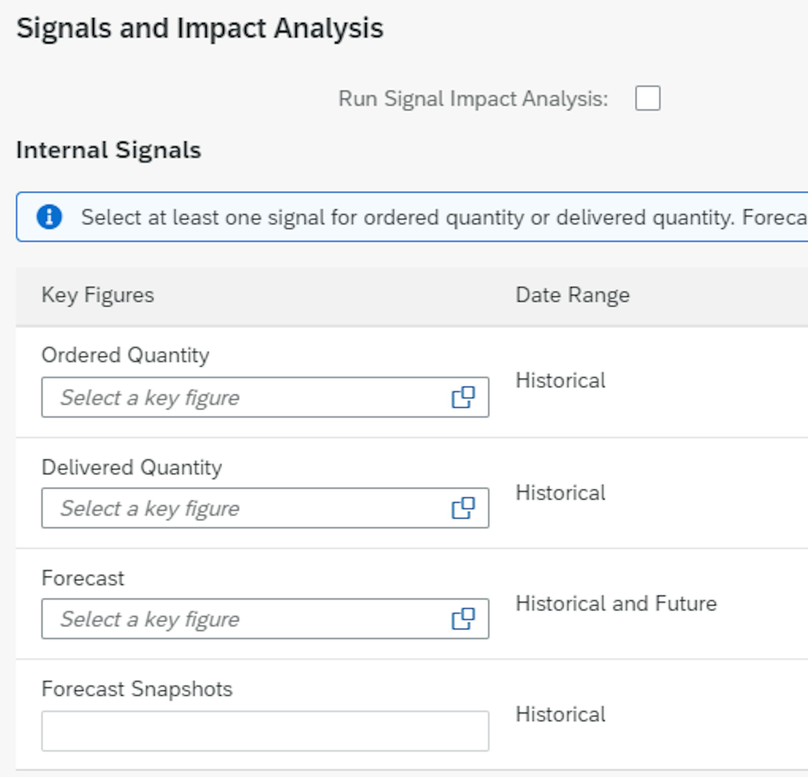
With the new release, you can now consider the IO Minimum Safety Stock and IO Maximum Safety Stock key figures as inputs when you create an inventory policy analysis in the Inventory Analysis app.
The IO Minimum Safety Stock and IO Maximum Safety Stock key figures enable you to consider the minimum and maximum amounts of safety stock that can be stored at a location in your inventory analysis. To use these key figures as inputs, create an analysis with an inventory policy analysis type. Under Inputs, the IO Minimum Safety Stock and IO Maximum Safety Stock key figures are automatically selected from the Input Key Figures list.
After creating your analysis, the minimum and maximum safety stock key figures are displayed in the Input View. You can modify these inputs and, after saving, use them to run a new scenario analysis.
With the new release of SAP IBP, the demand sensing algorithm using the gradient boosting method has been improved. The updates to the demand sensing algorithm are implemented as the algorithm is now able to calculate more correctly. The changes to the demand sensing covers both the algorithm itself and the user interface, which have been changed to make it easier as a user to make use of demand sensing.
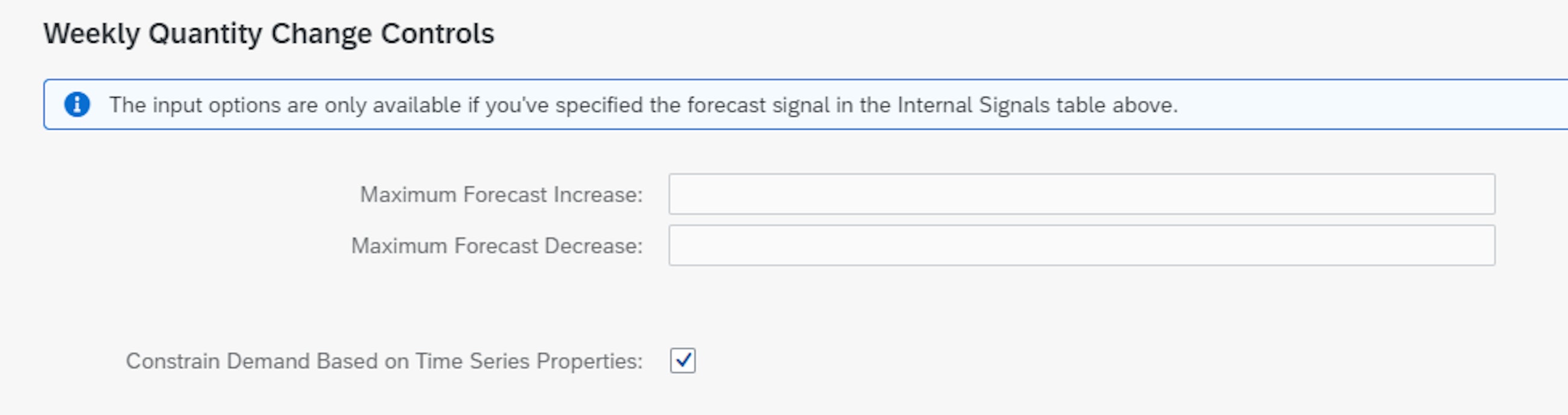
If we start by considering the user interface, SAP has enabled a more logical grouping of the settings that can be made in demand sensing. This has gathered and grouped the available options for the demand sensing inputs more logically. Furthermore, the old “Signals” and “Extra Signals” have been renamed “Internal Signals” and “External Signals”. At last, the option of running the time series analysis for demand sensing has been renamed “Constrain Demand Based on Time Series Properties” and is now chosen as a default.
SAP has also released a detailed business log for the demand sensing run where you are now able to display a business log for each individual step performed by the algorithm. This new business log provides insights into the demand sensing steps and makes troubleshooting significantly easier after a demand sensing run has been performed.
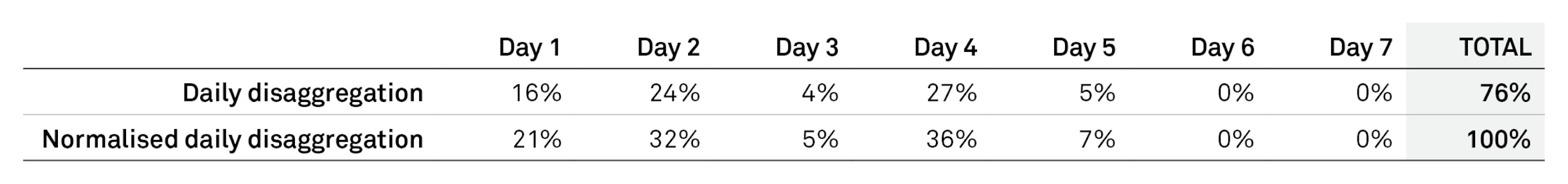
Moreover, making changes to the user interface, SAP has also enhanced the demand sensing algorithm itself. In the new release, a normalisation of the daily disaggregation profile override has been introduced. This means that with the new enhancement, you can override the daily disaggregation profile which has been split based on the automatic disaggregation optimisation. Before, the split meant that the sum of the weekly level would not always sum up to 100%. With the new feature, the algorithm automatically normalises the daily splits, so the weekly sum is equal to 100%.
At last, SAP has changed the handling of signals with no impact on the demand sensing. Previously, these figures were not included in the baseline when the signal impact analysis was performed. Now that these are included, the result should be less skewed compared to prior to this change. However, this should not drastically change the results of your demand sensing signal.
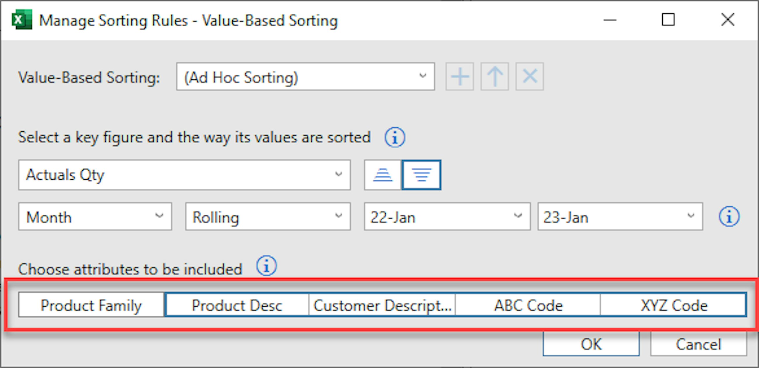
Following the introduction of value-based sorting in the 2211 release of SAP IBP, which allows users to sort their planning view based on key figure values, an additional enhancement has been brought with the 2302 release. Now, it is possible to exclude specified attributes from the value-based sorting rule and sort these according to an attribute-based sorting rule instead. Hereby, it becomes possible to do value- and attribute-based sorting in the same planning view.
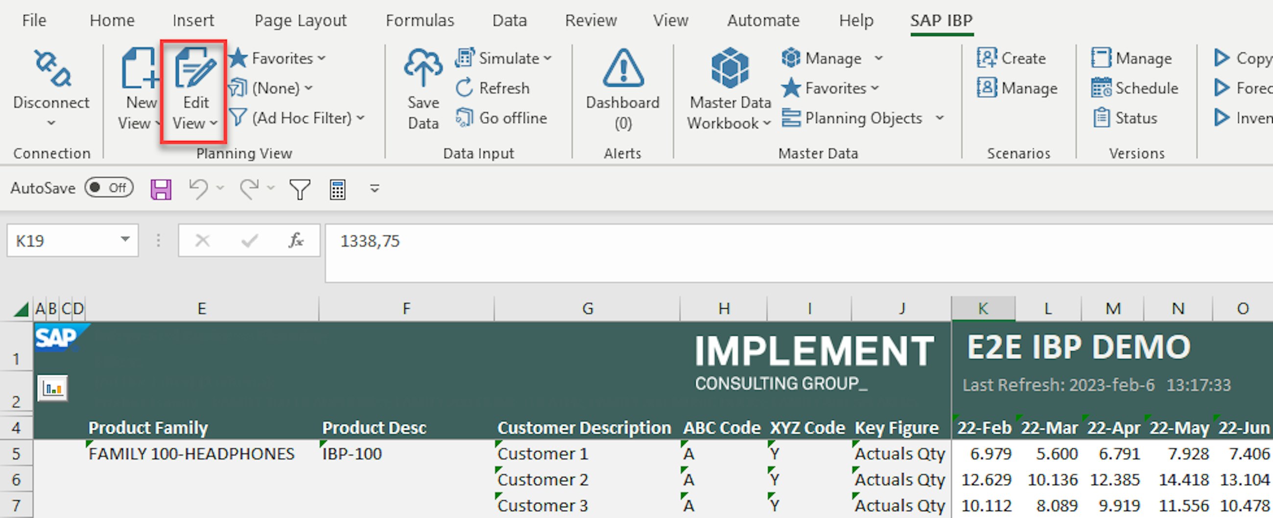
First, you must open the planning view that you wish to apply the sorting to. Hereafter, you need to go to the planning view drawing board, also known as “Edit View”.
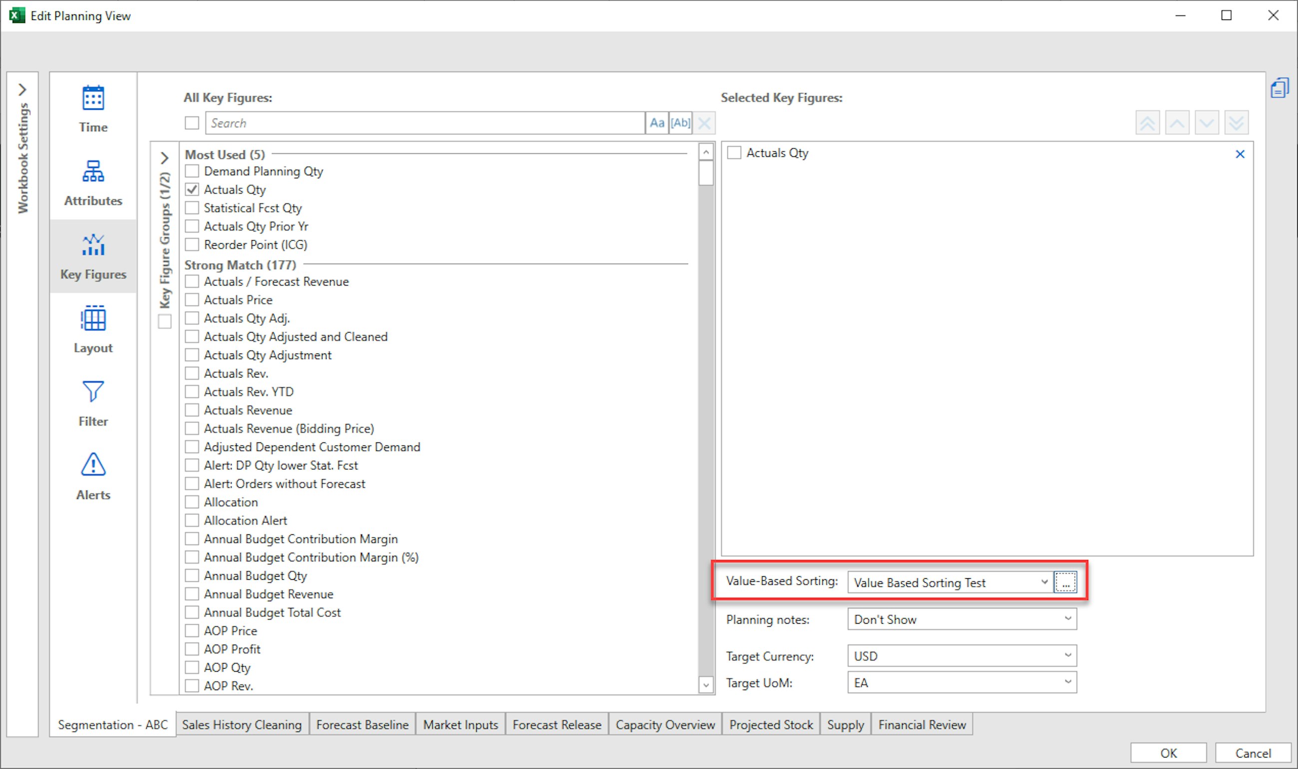
Go to the “Key Figures” tab and notice the “Value-Based Sorting” section that was made available in the 2211 release. Here, you have the option of choosing among sorting profiles that you have already created by using the dropdown, or you can create new ones by clicking on the three dots.
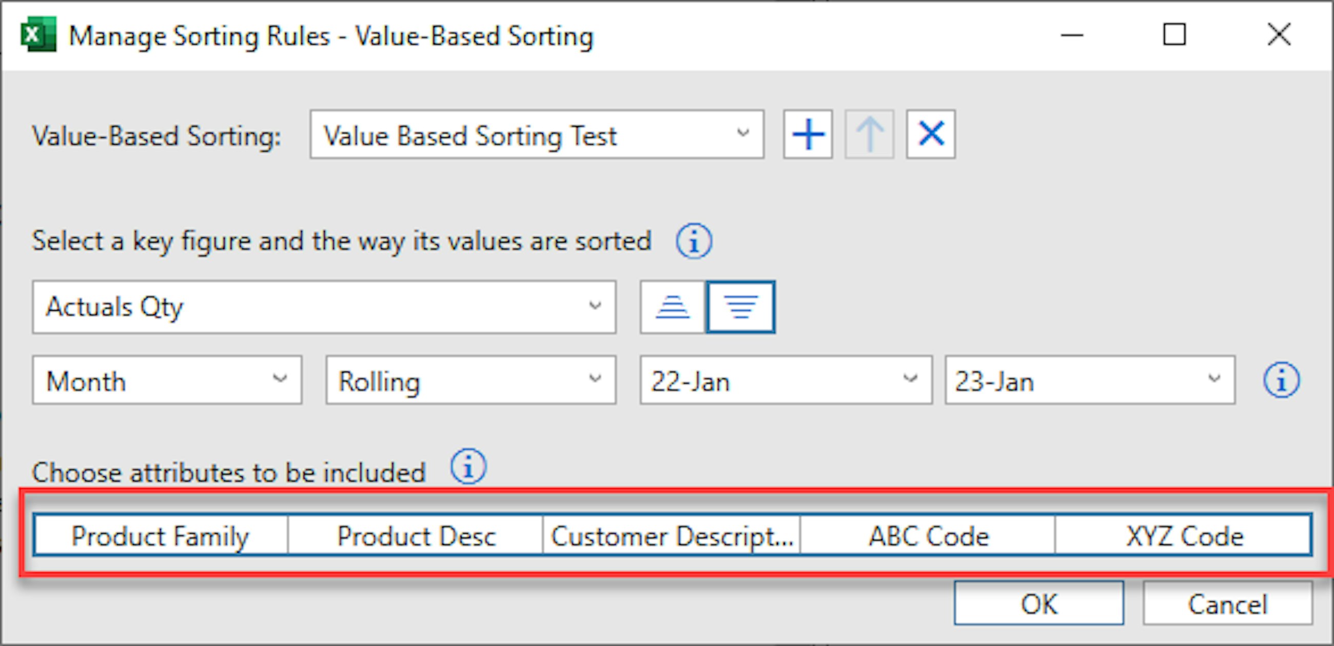
After clicking on the three dots, the Manage Sorting Rules dialogue box opens. From here, you can do two things: 1) define the value-based sorting profile that you wish to apply to the planning view and 2) choose the attributes that should be included in the value-based sorting of the planning view.
In this case, the planning view should be sorted in a descending manner according to the Actuals Quantity key figure on a rolling basis from January 2022 until January 2023. This period does not need to match the period displayed in the planning view, and the sorting will happen based on an aggregation of the key figure for this period.
Initially, all attributes in the planning view are selected to be included in the value-based sorting, and in this case, the entire data scope of the planning view would be sorted according to the Actuals Quantity key figure. However, by deselecting the Product Family attribute, it is possible to not consider this attribute in the value-based sorting.
By deselecting the Product Family from the value-based sorting, it is essentially possible to sort, based on Actuals Quantity, in product families rather than across product families.
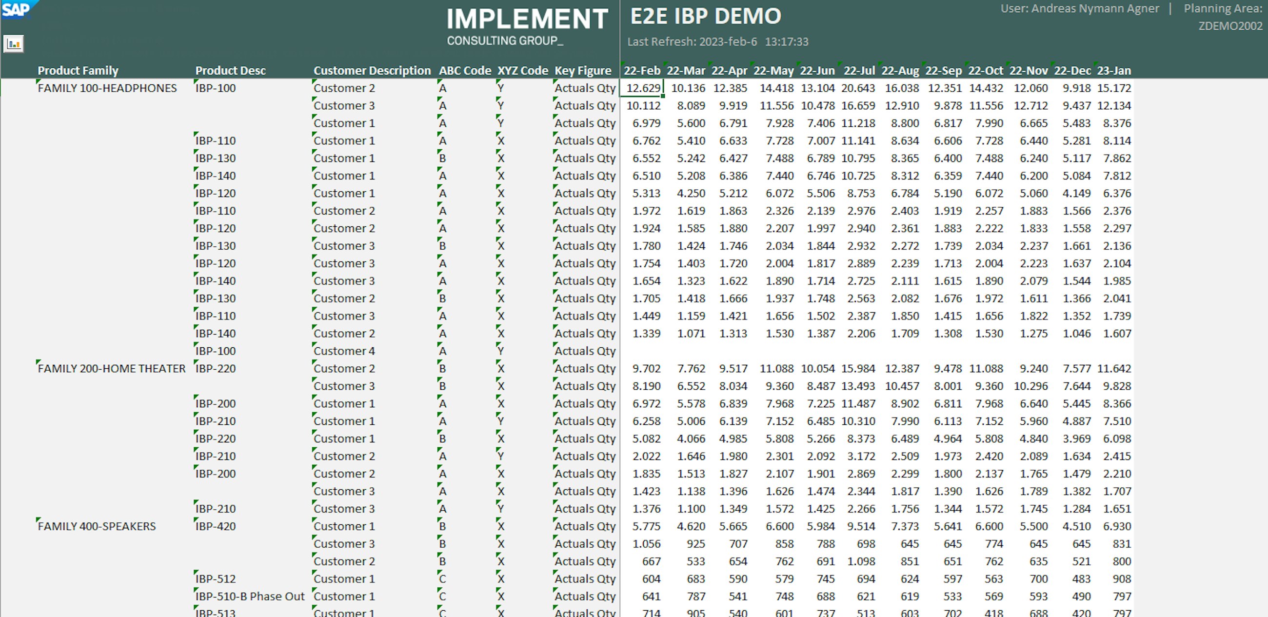
As seen from the planning view, the value-based sorting is applied according to the Manage Sorting Rules dialogue box. This enhanced ability to sort planning views enables users to gain important insights more easily without having to scroll or filter planning views but simply by sorting.
Following the highly anticipated introduction of the Manage Analytics Stories in the 2211 release of SAP IBP (follow link for our article on this release: https://implementconsultinggroup.com/article/new-features-of-sap-ibp-2211/), a series of improvements has been pushed out with the newest release. The improvements are especially related to the formatting and look of the user-created stories as well as a strengthened ability to filter based on the users’ needs.
Three new features will be described presently: 1) defining preferences for story pages, 2) chart scaling to enable comparison between charts and 3) improved filtering capabilities.
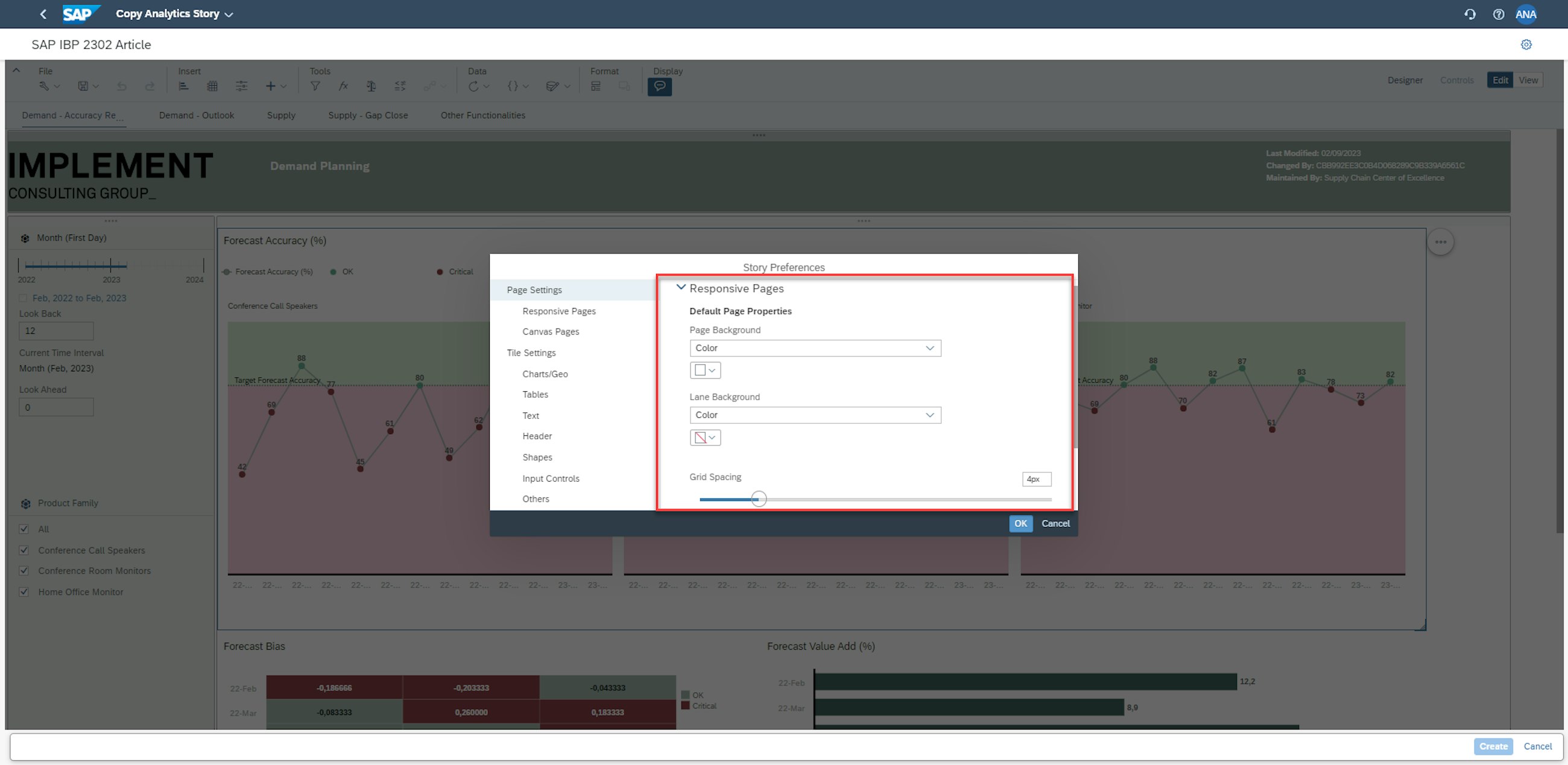
Story preferences
To ensure a consistent design of your stories, it can be beneficial to specify a default formatting that ensures similar design choices throughout the Analytics Story.
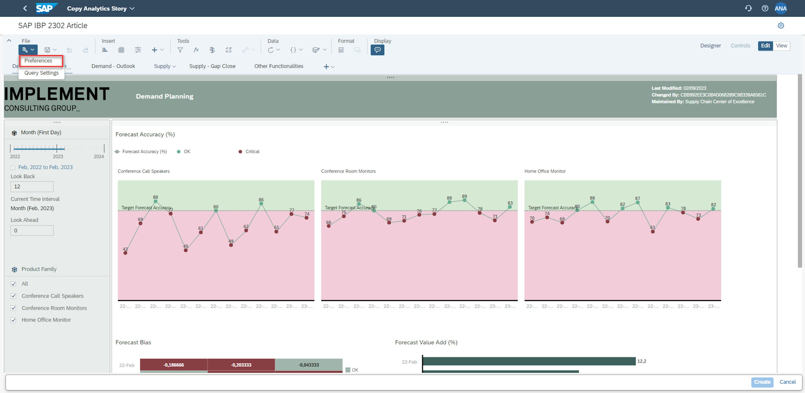
To do this, open the story that you wish to have a default format for and open the preferences dialogue box.
In the preferences dialogue box, it is possible to specify formatting for both the page and for tiles. For pages, it is possible to edit the page and lane background colours. This will dictate the background and thereby a big part of the visual impression of the Analytics Story.
For the tiles, there is a significantly broader range of design options. The user can define default colour palettes, table design, text and header formatting as well as shape and input control layout. A full list of the design possibilities can be found in the link below:
Improved filtering capability
Another enhancement is the strengthening of the filtering capabilities in the Manage Analytics Story application. One of the options for filtering is utilising input controls, which was described in our article on the initial release of the Manage Analytics Story application, found below:
https://implementconsultinggroup.com/article/new-features-of-sap-ibp-2211/
While input controls are extremely useful in quickly selecting the data you wish to display, this section will focus on the alternative filtering options available in the application.
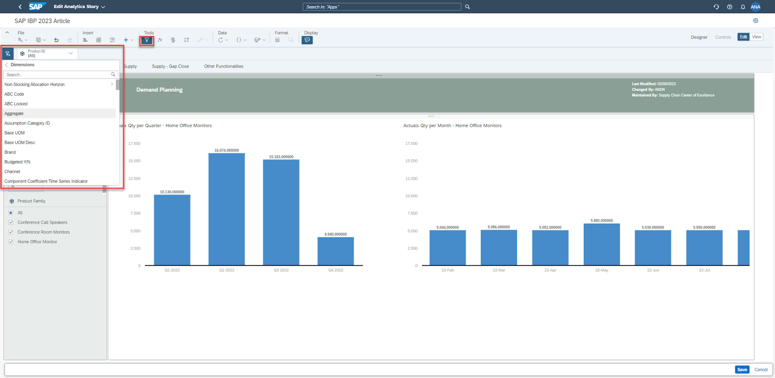
To apply a filter to a given Analytics Story, you need to click on the funnel icon in the Tools section of the ribbon. From here, you need to click the blue-ribbon button with the plus symbol in the corner. You have the option of applying a filter based on one of two things: 1) variables, such as target currencies or target unit of measures, and 2) dimensions, which is explored further here.
As can be seen from the picture above, the dimensions filtering options allow the user to implement filter based on the attributes belonging to the planning area.
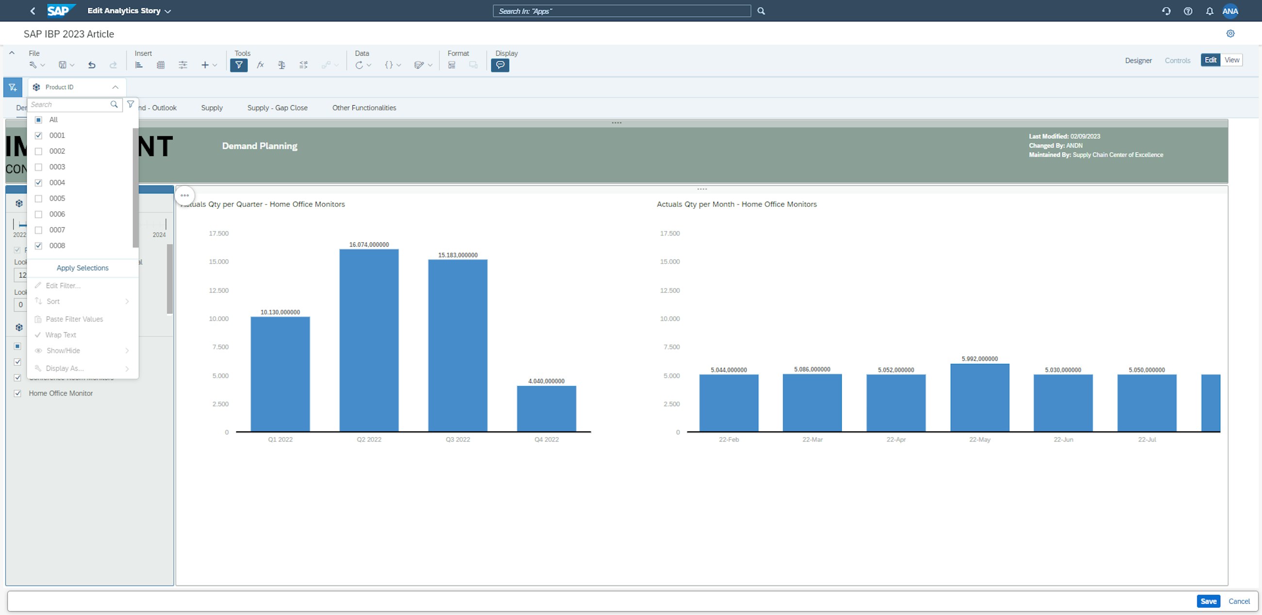
In this case, the product ID is selected as the filtering attribute. As default, the full range is selected to be displayed, but the user has the option of excluding certain values. In this case, only product ID 0001, 0004 and 0008 are selected to be visualised in the entire story.
At this point, a comment on status and dynamic filters needs to be mentioned. The initial filtering is done on all values, meaning that until the filter is changed, the story will display all values regardless of the attribute value. However, when the filter is changed, as in the example above, any new additions to the data scope of the planning area will not be included in the analytics story. Say a product named 0009 is added to the scope, this product will not be displayed in the story because it is omitted from the filter.
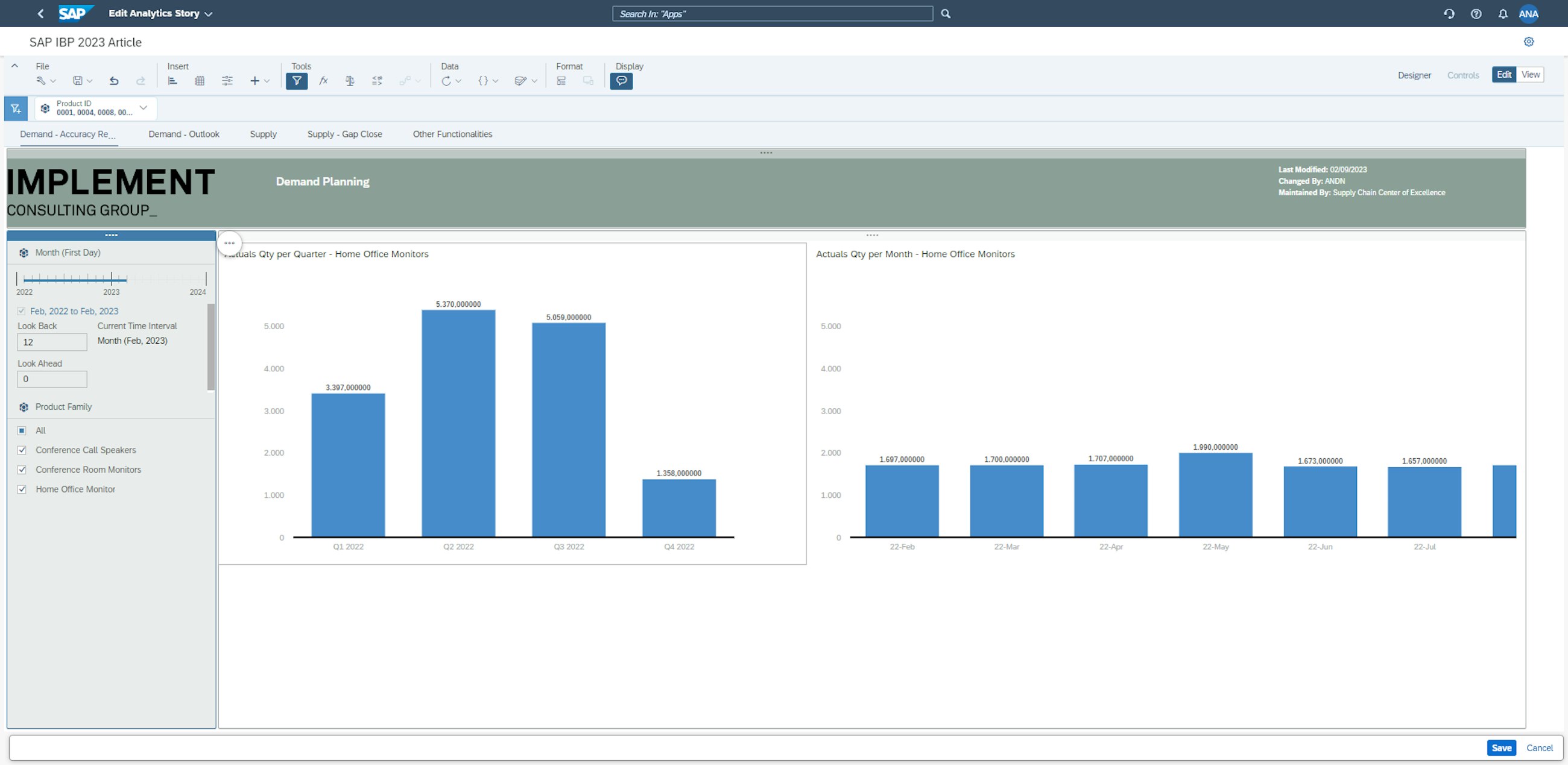
After selecting the desired product IDs and clicking the Apply Selections button, the Analytics Story is updated based on the filtering. Notice that the values are updated due to all other products than 0001, 0004 and 0008 now being omitted from the visualisation.
The improved filtering option enables the user to more easily limit exactly the data scope relevant to their specific needs.
Chart scaling
The final feature to be described here is the chart scaling. In some instances, you can have an analytics story in which multiple charts are displaying the same measure or key figure. For different reasons, the measure values can potentially be sized differently in the charts, and this can complicate the comparison of the measure across the charts. With the 2302 release, and the introduction of chart scaling, the Manage Analytics Story application now has an easily applicable solution to this challenge.
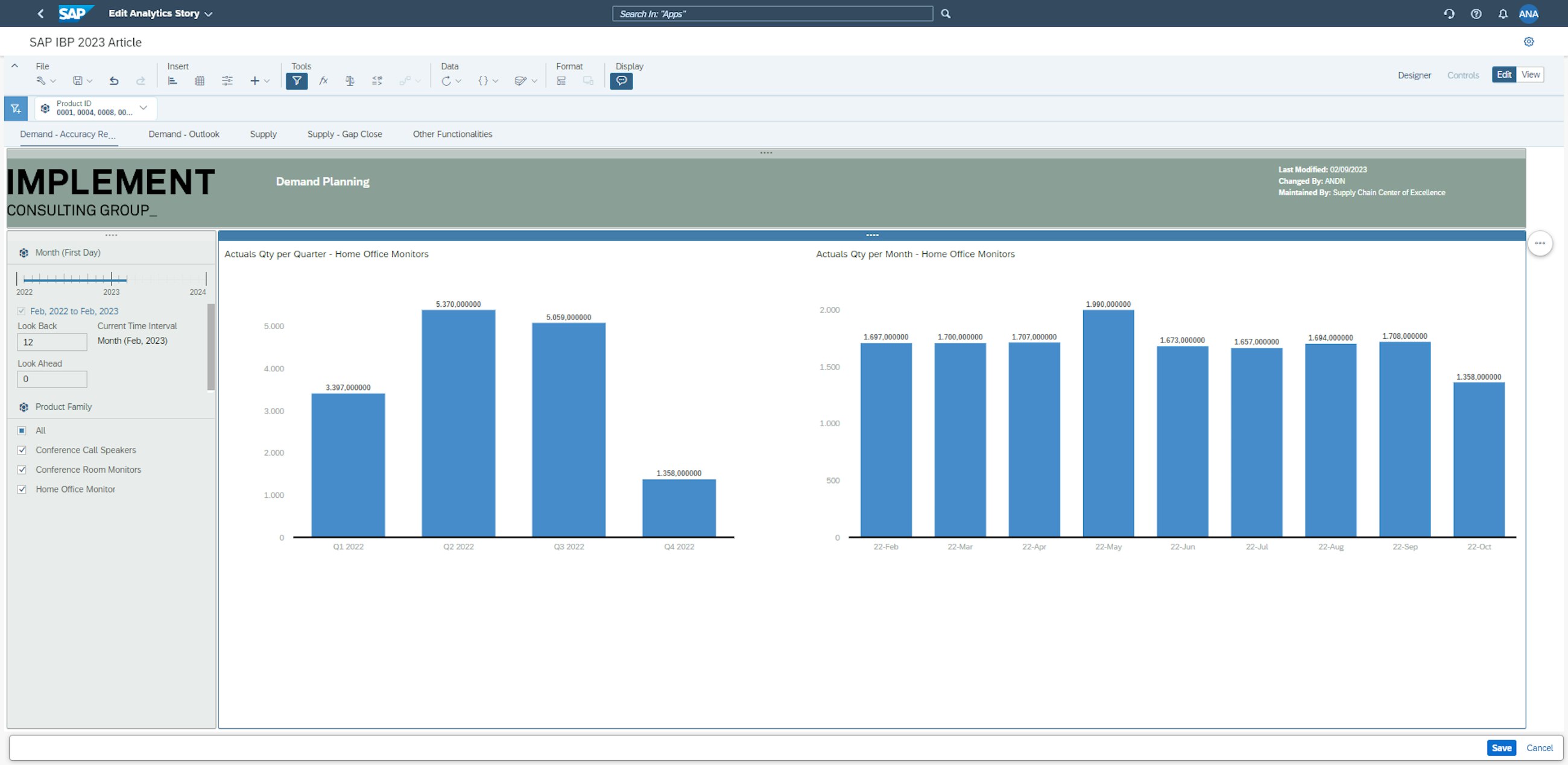
First, open the Analytics Story that contains two charts depicting the same measure, sized differently.
In this case, we have two charts depicting actual sales of home office monitors; however, because of the different chart scales, the charts are not initially comparable. The quantity on the right seems to be quite similar to the chart on the left, but this is not the case. This mismatch is resolved by scaling the charts.
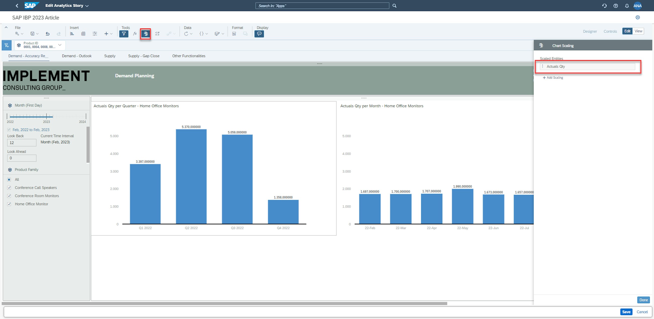
By clicking the scale icon in the Analytics Story, the Chart Scaling dialogue box is opened. From here, we need to select the measure that we want to scale, in this case the key figure Actuals Quantity.
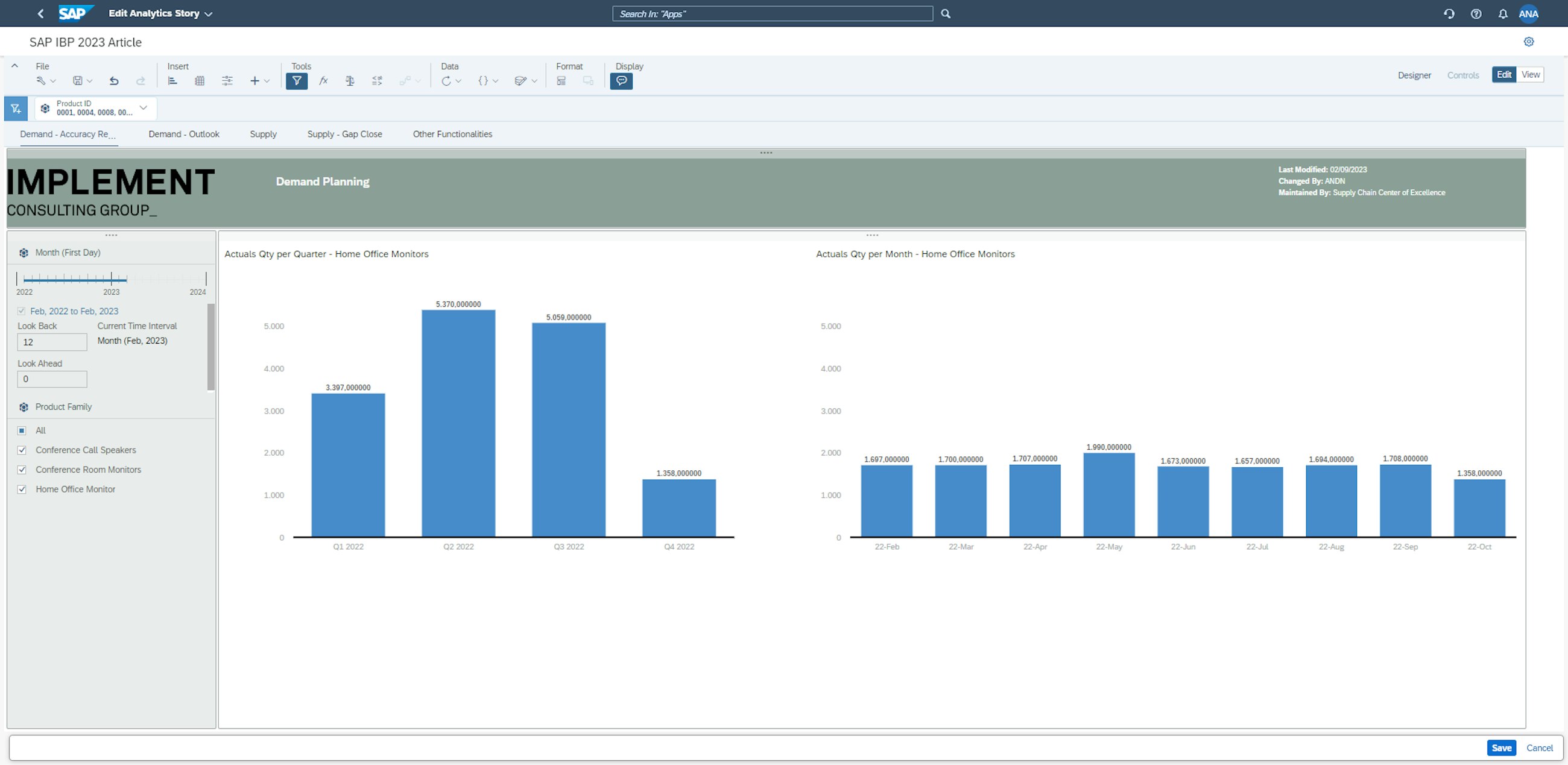
After clicking done, we can now see that the two charts are comparable, as the charts have scaled accordingly, and the bars in the chart on the right have been adjusted significantly downward.
The charts are now easily compared without having to manually adjust any of the axes. Please note that if desired, it is possible to exclude specific charts from the scaling rule. The ability to easily make charts comparable further strengthens the ability of the Manage Analytics Story to provide readily available insights in a reader-friendly and highly customisable format.