Article
Five selected features of the 2211 upgrade of SAP IBP

Article
Read more
24 November 2022
With the latest release, it is now possible to create group tasks and use them with collaboration tools. In fact, since the collaboration tools do not handle group tasks, a shared task is created in the collaboration tool with separate statuses for your assignees.
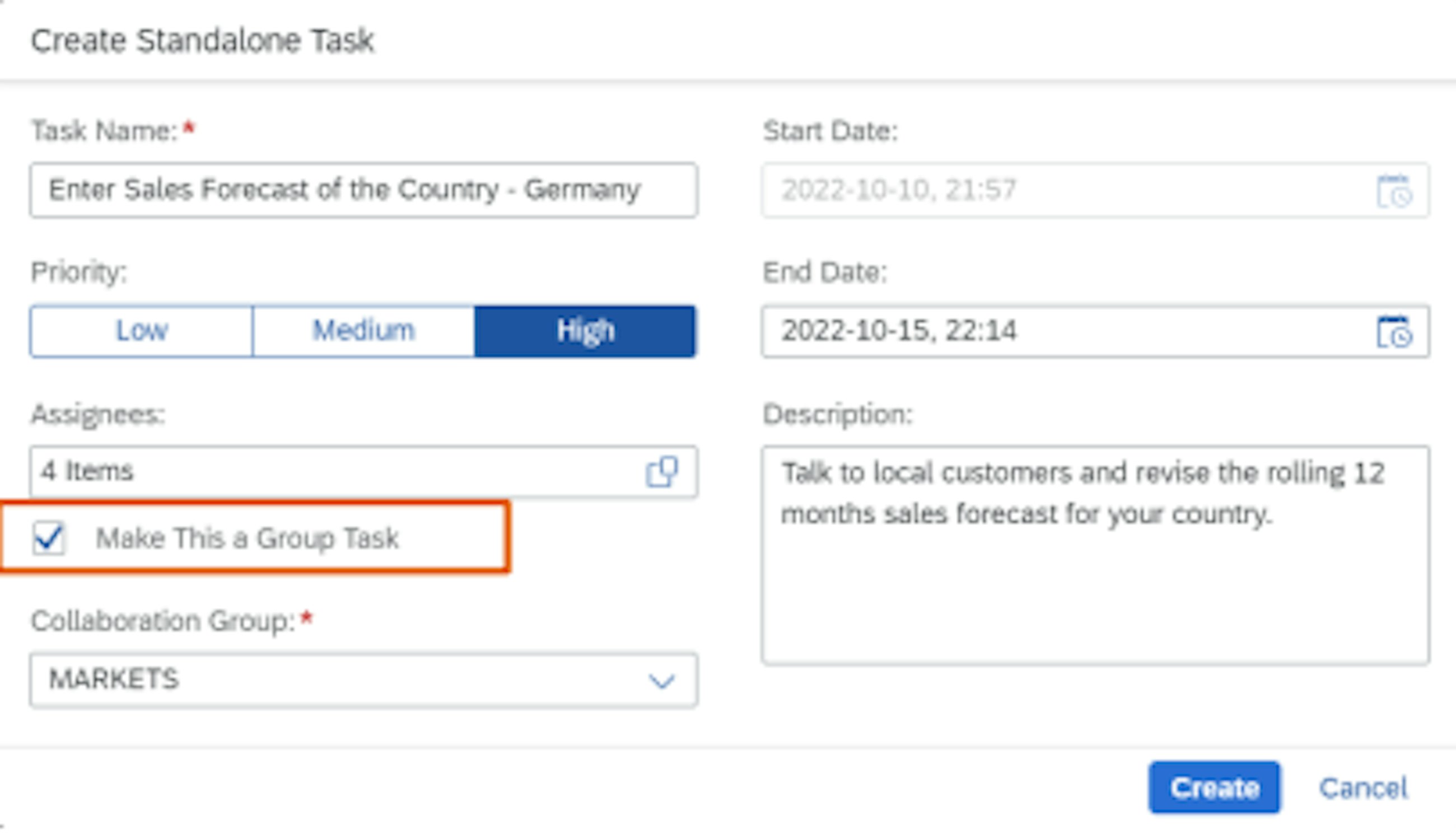
A Group Task is a task that is assigned to multiple people, to be executed and completed by any of them. With the latest release, it is now possible to synchronise the group tasks to the collaboration tools (SAP Jam and Work Zone).
When one assignee changes the task status to In Progress in the collaboration tool, the task is synced back to SAP IBP, where its status changes to In Progress. SAP IBP syncs the task back to the collaboration tool, and the status of the corresponding collaboration task also becomes In Progress for all assignees.
When one assignee changes the task status to In Progress in the collaboration tool, the task is synced back to SAP IBP, where its status changes.
Moreover, process-related tasks created by IBP process management are synchronised to the respective collaboration group of the process step; while standalone tasks created in IBP are synchronised to the collaboration group that was specified during task creation.
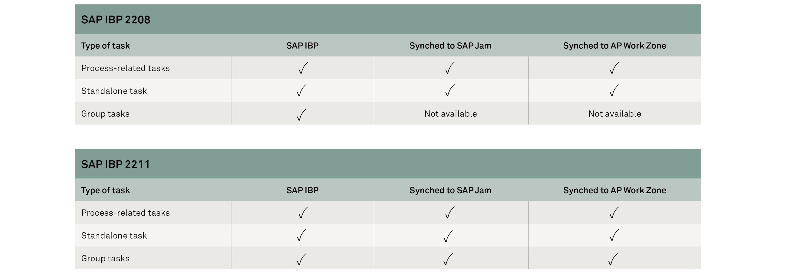
Here is the summary of the new embedded functionalities in the synchronisation of group tasks and collaboration tools:
In addition, the navigation to the collaboration tool from the General Information section of the task details has been improved. You can now navigate straight to your collaboration task.
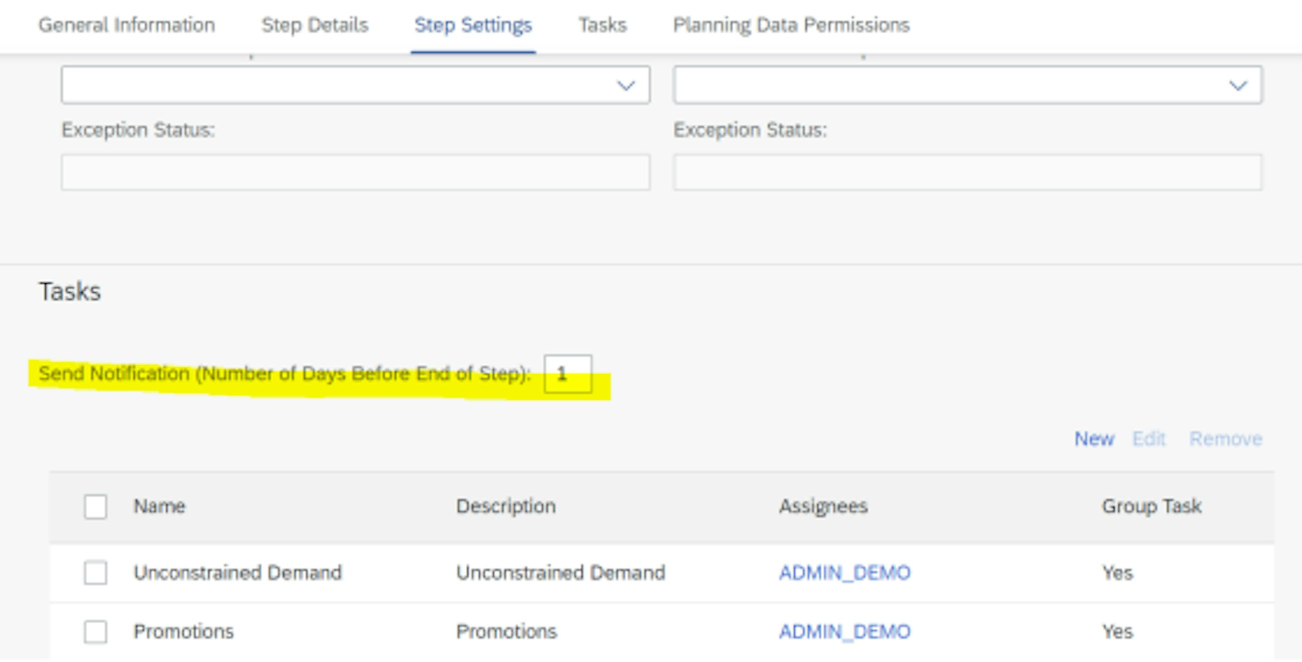
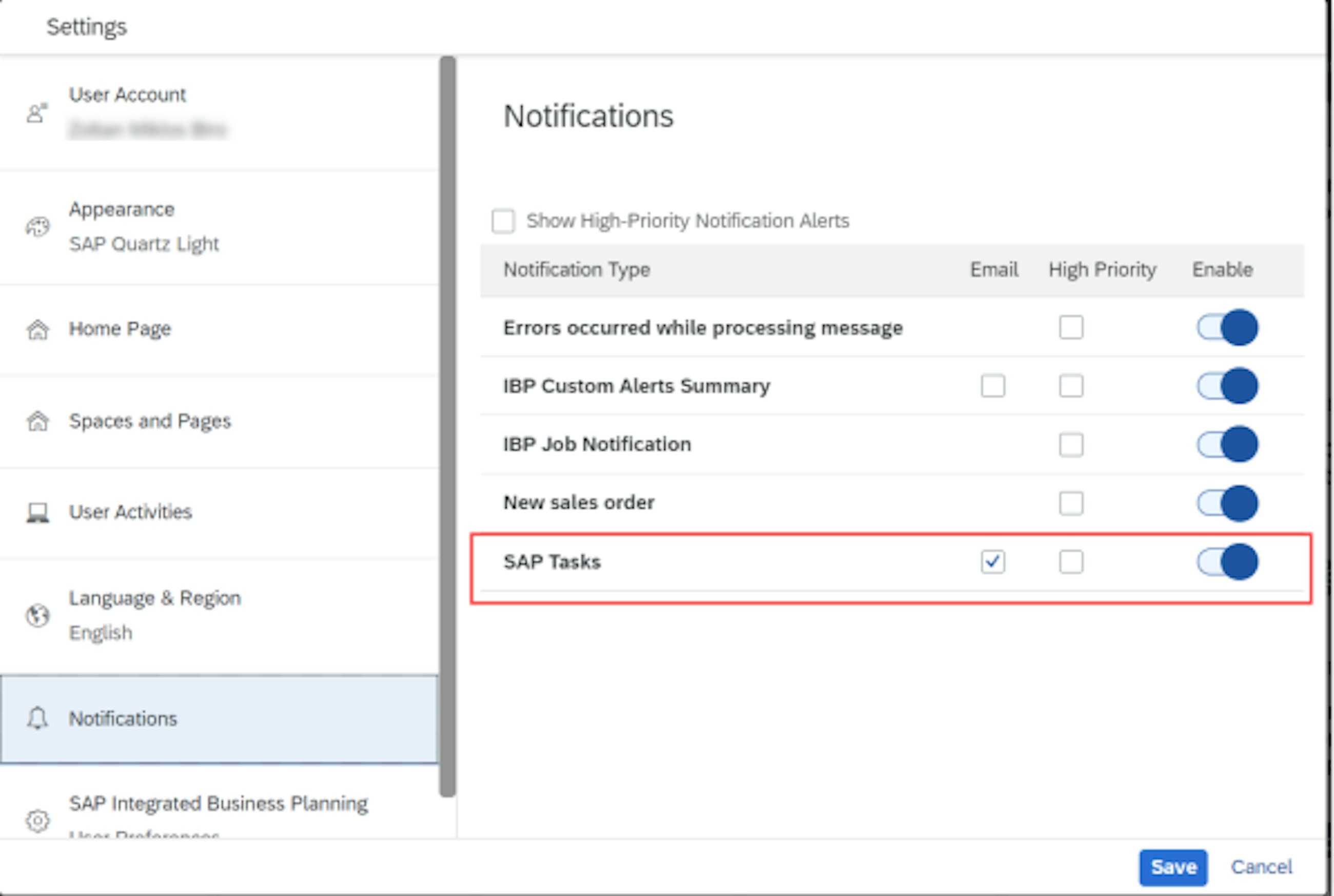
Another feature of the latest release is email notification for due tasks. You can now activate an email notification in your user settings on the SAP Fiori launchpad to receive a reminder that a task is due in process management. To do so, you must:
2. Enable the notification for the SAP task in the user settings. First click on the User icon, then click on Settings > Notifications. There you can choose to allow email notification for SAP tasks.
Last but not least, the Log in the Manage Process app has also been improved. Now, when a process-related task is completed in SAP IBP, an application log is generated and displayed in the process feed of the Manage Processes app, under the step for which the task was completed. The log has been improved with the addition of the task name and user ID of the person who completed the task. Previously, the application log contained only the information that a task was completed.
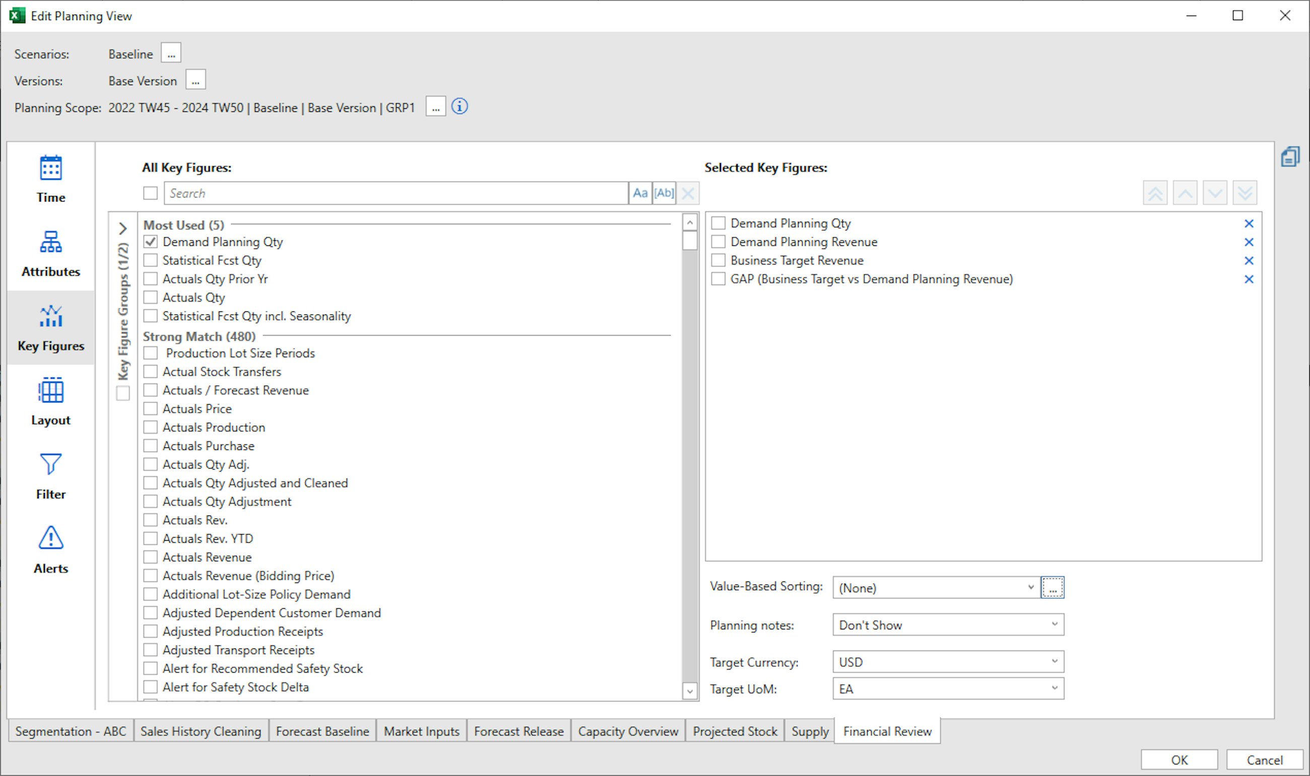
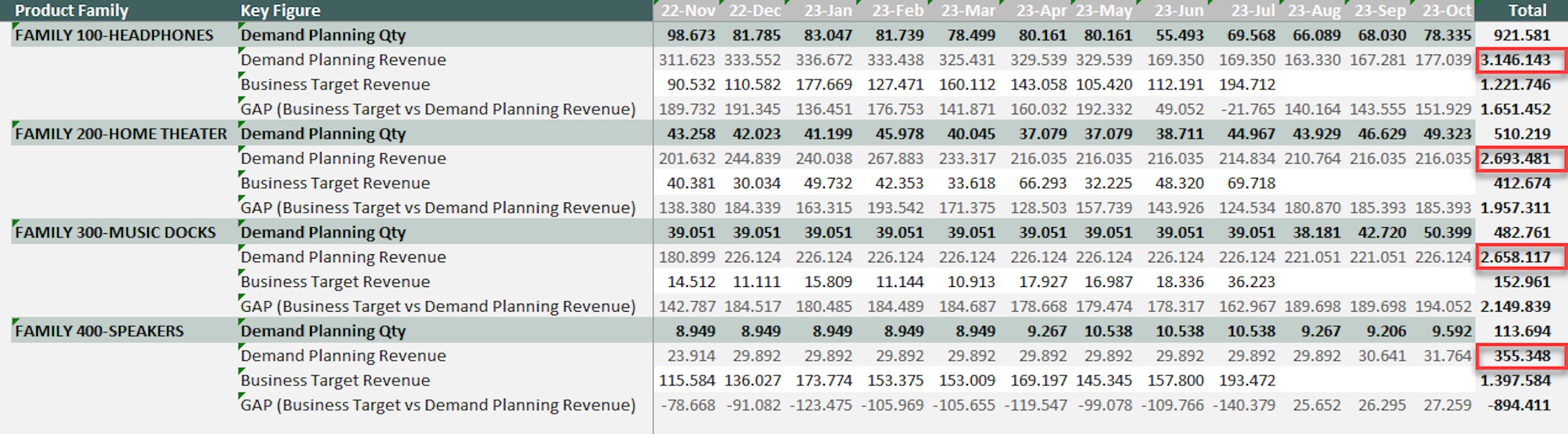
For a long time, it has been difficult to create a view that focuses on the most important product, based on the total sales or value of that product. Luckily, this has been resolved with the upcoming release of SAP IBP 2211. With the new feature of sorting your key figures, you can now focus your effort where it matters the most in your planning scope.
This new addition to the Excel add-in may seem small, but it is truly something that we have missed in our planning process, and it helps planners focus on exception-based planning rather than viewing all products at once.
If you update to Excel’s 2211 add-in, the new feature is automatically added to the “Key Figures” tab in the SAP IBP add-in. From this, you can automatically create the sorting of a selected key figure in the planning view.
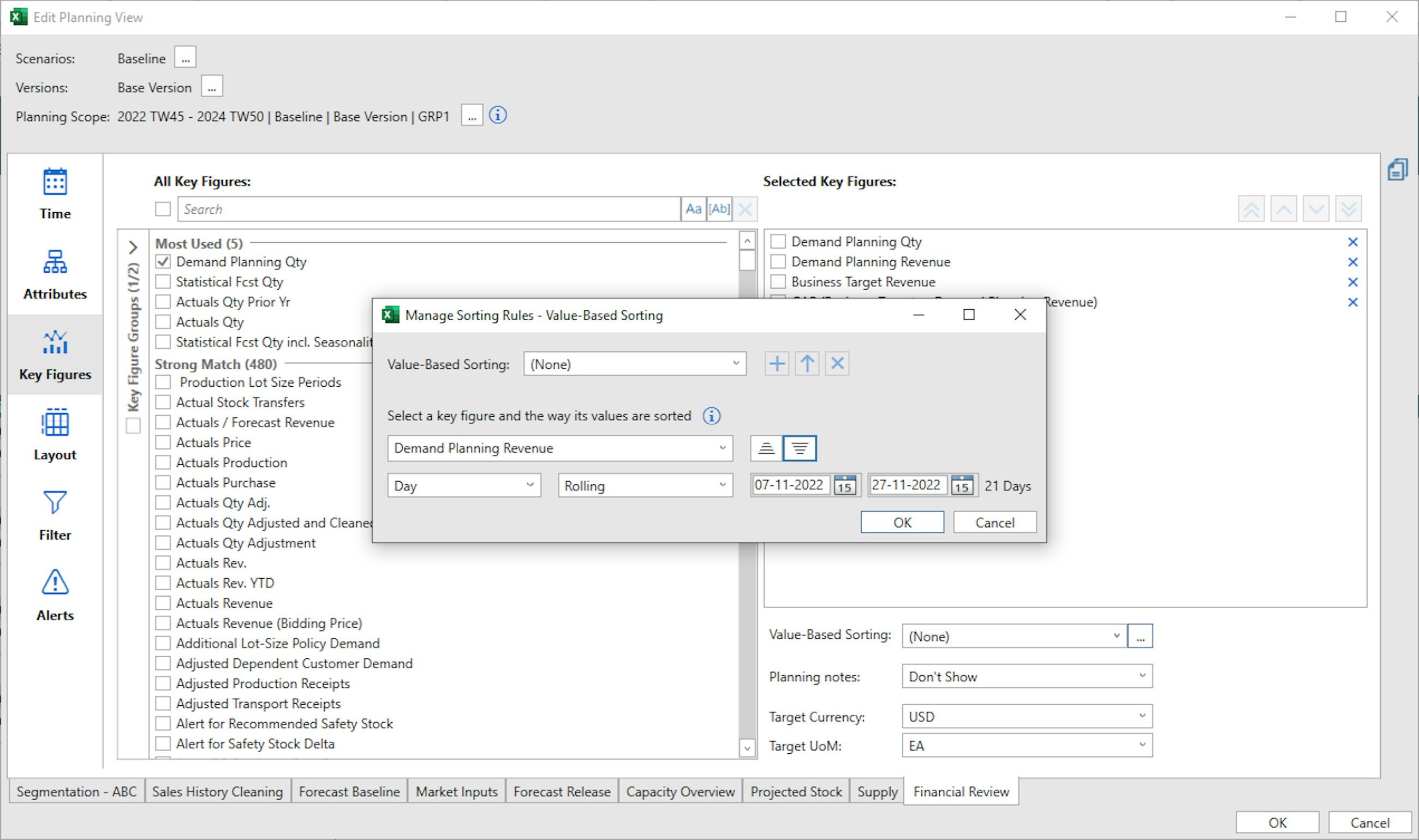
When you push the three small dots next to the Value-Based sorting drop-down, a new pop-up appears, and here you are able to create your Value-Based sorting. In the pop-up, you can decide which key figure to base this on, the time horizon and whether this should be descending or ascending.
When you have selected your Value-Based sorting, your planning view is automatically sorted based on your filter criteria. This enables you to focus on the planning objects that really impact on your plan.
With the new feature, you can create a new sorting rule, use a rule that you have previously specified in the drop-down list or even update an existing rule that you have created. The only limitation to the new addition is that this only works for one scenario or version at a time. Furthermore, only the attribute grand totals are supported, as this does not work with sub-totals.
For the new 2211 release, SAP has enabled users to overwrite the planning calendar information during an interactive planning run. The overwrite of a calendar key figure is relevant for supply planning if you want to simulate how additional non-working days will affect your projected stock, the number of transportations and other elements affecting the working capital of your inventory. The calendar key figures enable you to simulate your assumptions quickly and without changing the master data or changing the master data calendars just for simulation purpose.
Please remember that, in order to use them, these calendar key figures must be added to your planning area. Furthermore, the calendar key figures will overrule the values in the calendar key figure for the specific period, but they will not permanently overwrite the information in the created planning calendars.
The overwrite is performed through the existing calendar key figures:
The planning calendars can also be used as actual calendars, if you do not want to integrate factory calendars from the Enterprise Resource Planning system; however, this is not recommended as it will result in manual maintenance of opening and closing periods.
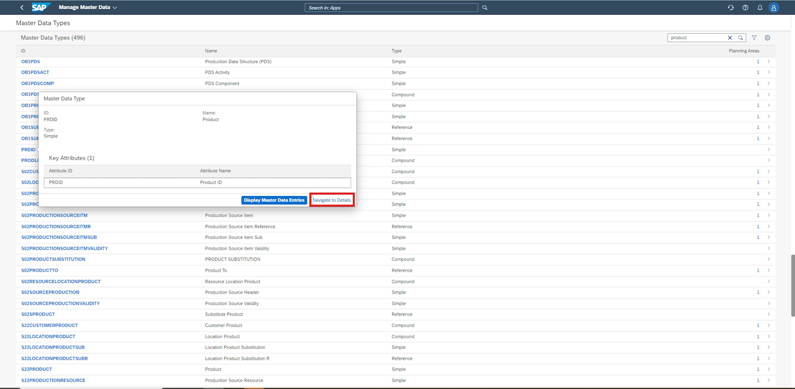
Following the continuous improvements to the Manage Master Data application from the previous version of SAP IBP, additional enhancements are introduced in the 2211 release of SAP IBP. The ability to manage master data has been improved both by enhancements to the Manage Master Data app, but also by the introduction of a new app, Manage Rules for Master Data Maintenance, and a new application job, Rule-Based Master Data Maintenance. For the Manage Master Data app, two functionalities have been added.
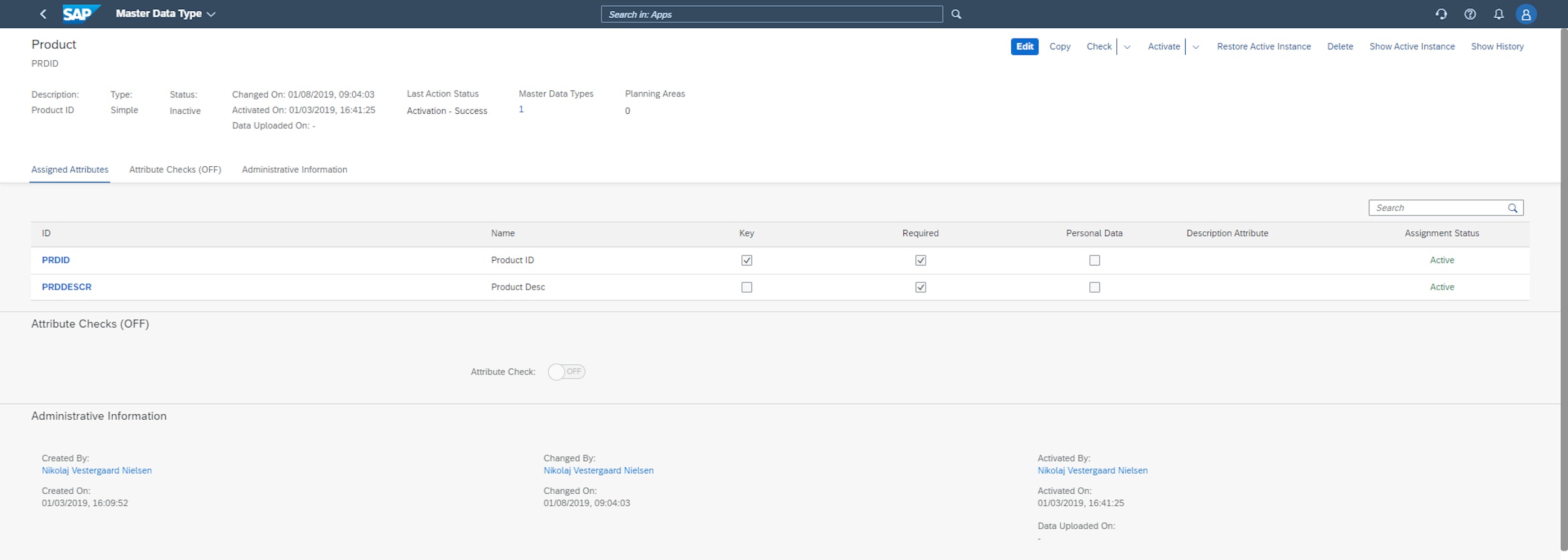
From the initial screen of the Manage Master Data application, it is now possible to move directly to the Master Data Types configuration application. As a user, you just need to select a master data type in the Manage Master Data application and click the Navigate to Details button in the popover that appears.
You are then taken directly to the Master Data Types configuration application, from where you can edit, copy and activate the master data type.
Additionally, it is possible to access the detailed view of the Manage Master Data application by choosing the Display Master Data Entries from the mentioned popover.
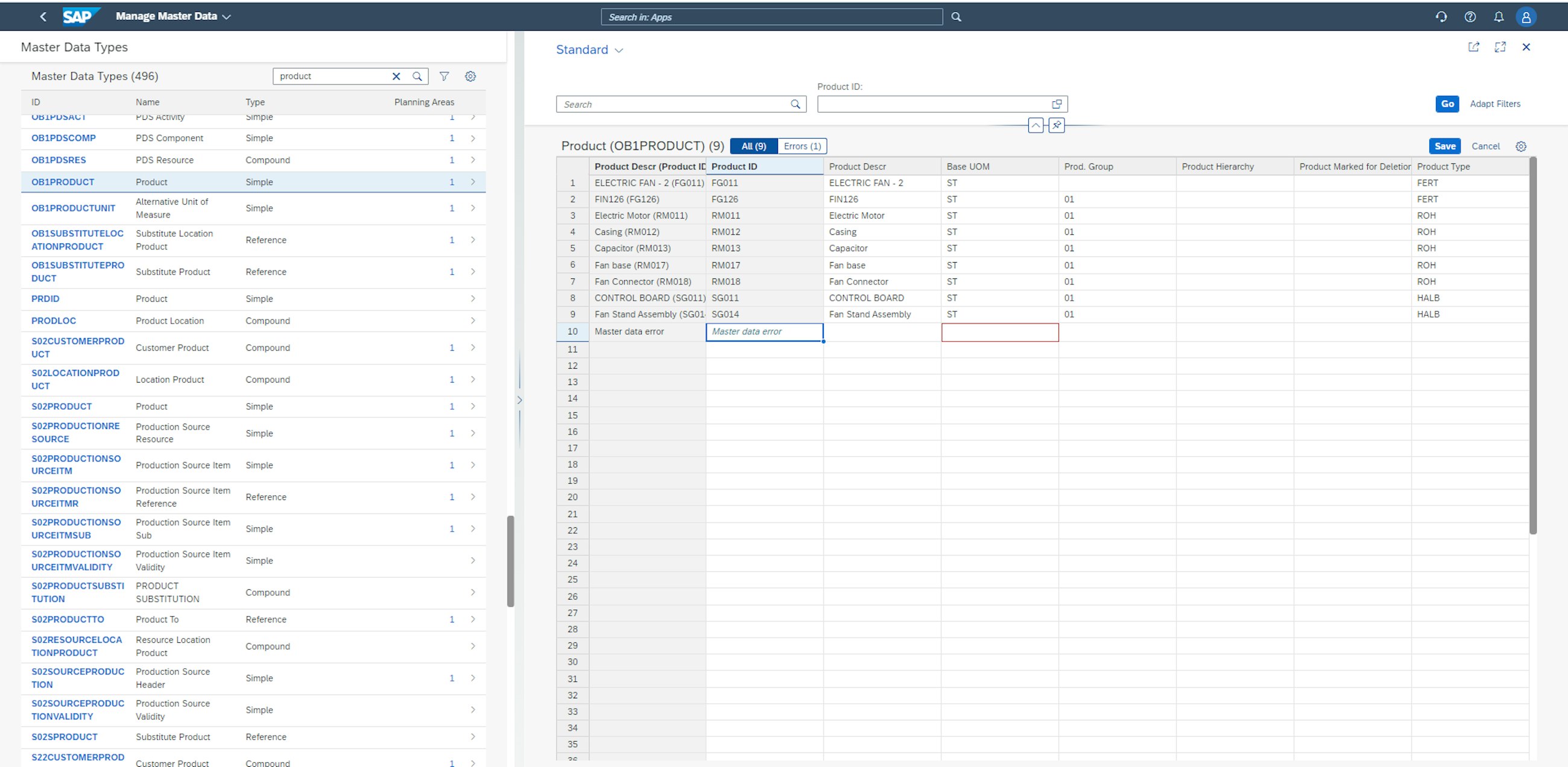
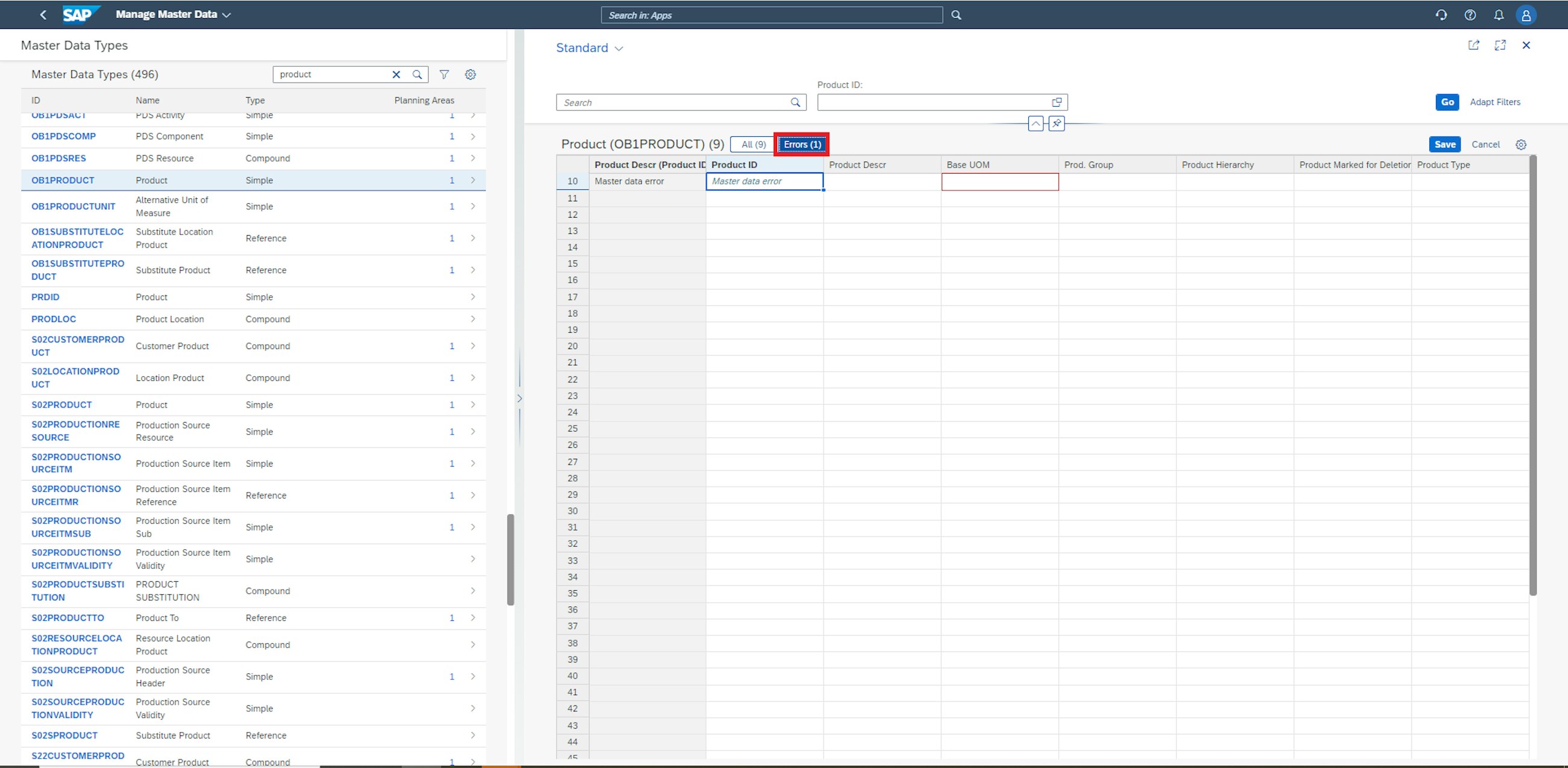
The other functionality is the introduction of the ability to Filter by Errors in Mass Edit Mode in the Manage Master Data application. If you maintain a large set of master data with a series of errors spread throughout, it is now possible to only display the erroneous entries. To do this, simply open the master data set from which you want to clean errors.
Go to the errors tab and see that only erroneous master data entries are displayed in the entry window. This new feature will significantly reduce the amount of manual work needed to clean errors from a set of master data.
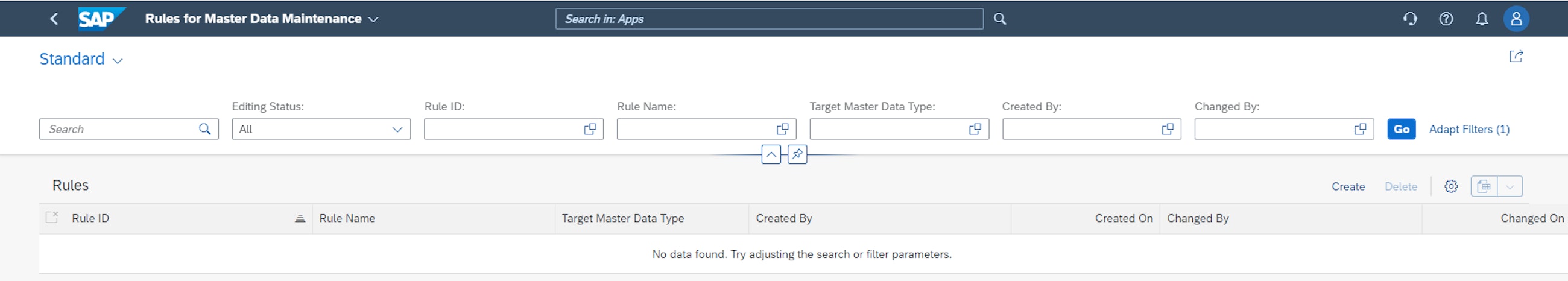
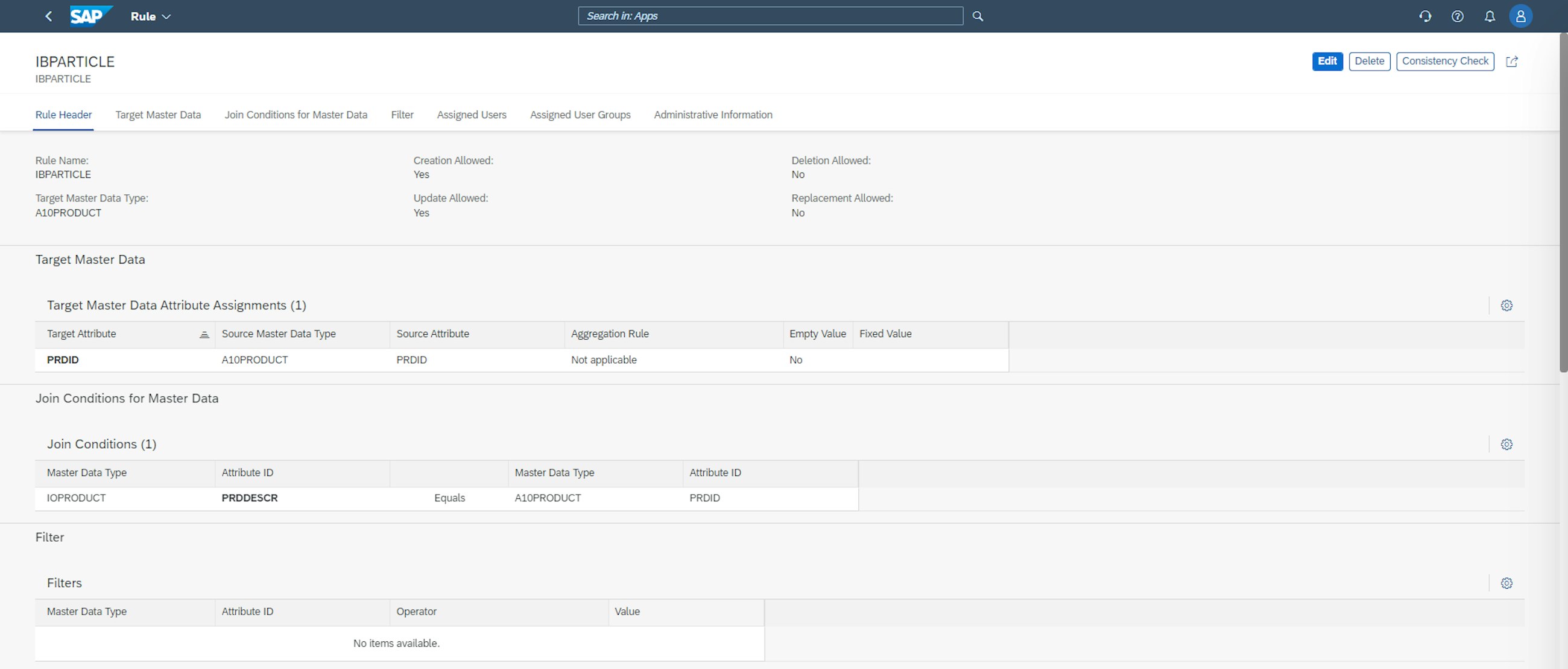
As mentioned, a new master data management app has also been introduced, which is called Rules for Master Data Maintenance. When accessing the application, you have the ability to create new rules for master data maintenance as well as delete already-defined rules.
When creating a new rule, you need to specify a rule name and, importantly, the target master data type – which is the master data type that the rule targets. It is possible to enable the rule to create, update, delete or replace master data. In the example below, create and update are allowed. The Target Master Data Attribute Assignments and Join Conditions for Master Data must also be defined. It is also possible to apply filters and share the rules with other users and user groups. You can find an example of such a rule below.
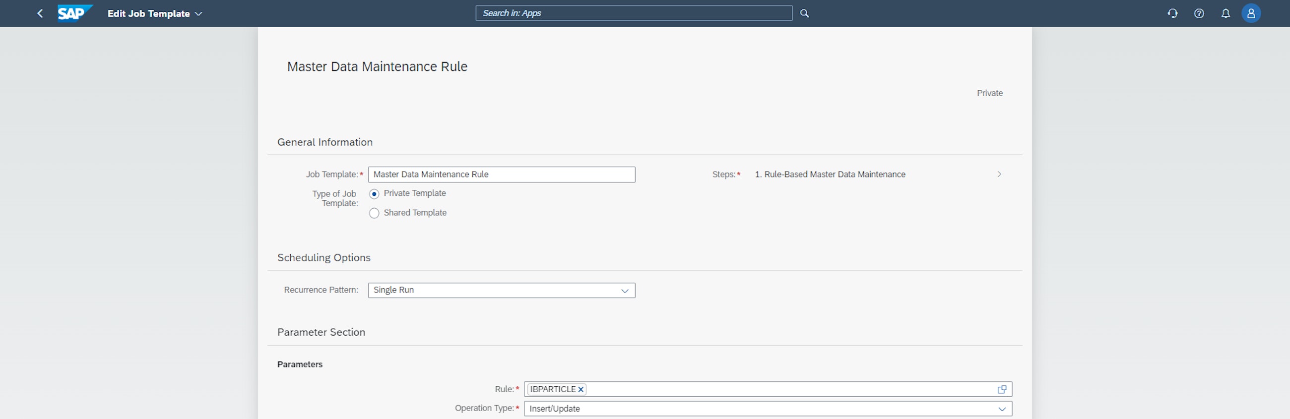
Finally, after creating the master data maintenance, the new application job, Rule-Base Master Data Maintenance, can be defined to run the rule with a given recurrence pattern or as a single run. It is necessary to specify the rule and operator type that the application job is linked to, and then the application job can run.
The ability to do rule-based master data maintenance and incorporate this into scheduled application jobs is a huge development of the master data management in SAP IBP, and for some users, it will significantly reduce the magnitude of manual work in this part of the supply chain process.
One of the most highly anticipated parts of the 2211 SAP IBP release is the introduction of the new application Manage Analytics Stories, also known as embedded SAC. The Manage Analytics Stories application enables users to create charts and advanced dashboards, and these visualisations are gathered in what is called stories. The application is somewhat similar to what users will recognise from SAP Analytics Cloud.
Some of the highlights from the application explored here include:
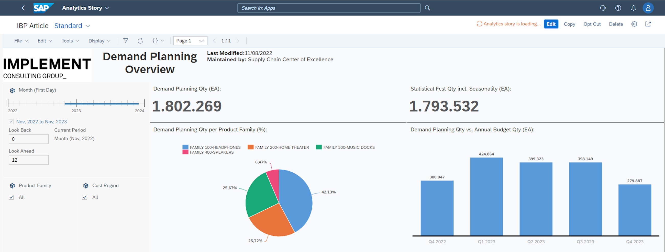
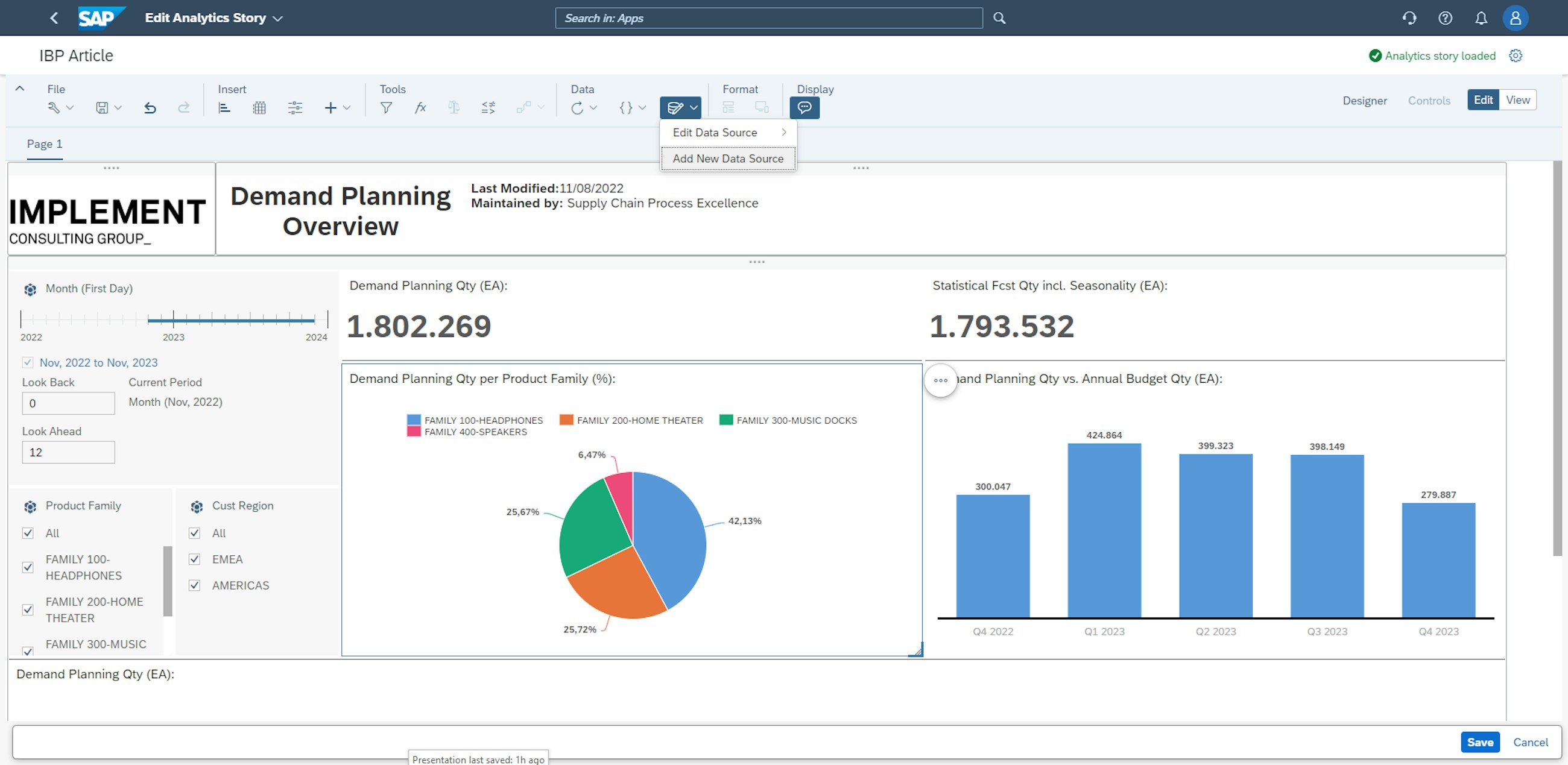
One of the key dimensions of the Manage Analytics Stories application that makes it attractive is the ability to freely design dashboards as you see fit. This is enabled by a grid-based design feature. An example of how this flexible canvas could be used is shown in the picture below. However, this is just one example, and the app gives users lots of room to use all their creative intuition to convey whatever messages and stories they wish.
In the example above, a combination of chart elements is used, including pie and bar charts. There is also more design freedom in terms of naming dashboards, specifying owners, dates of modification and adding company-specific logos or other imagery.
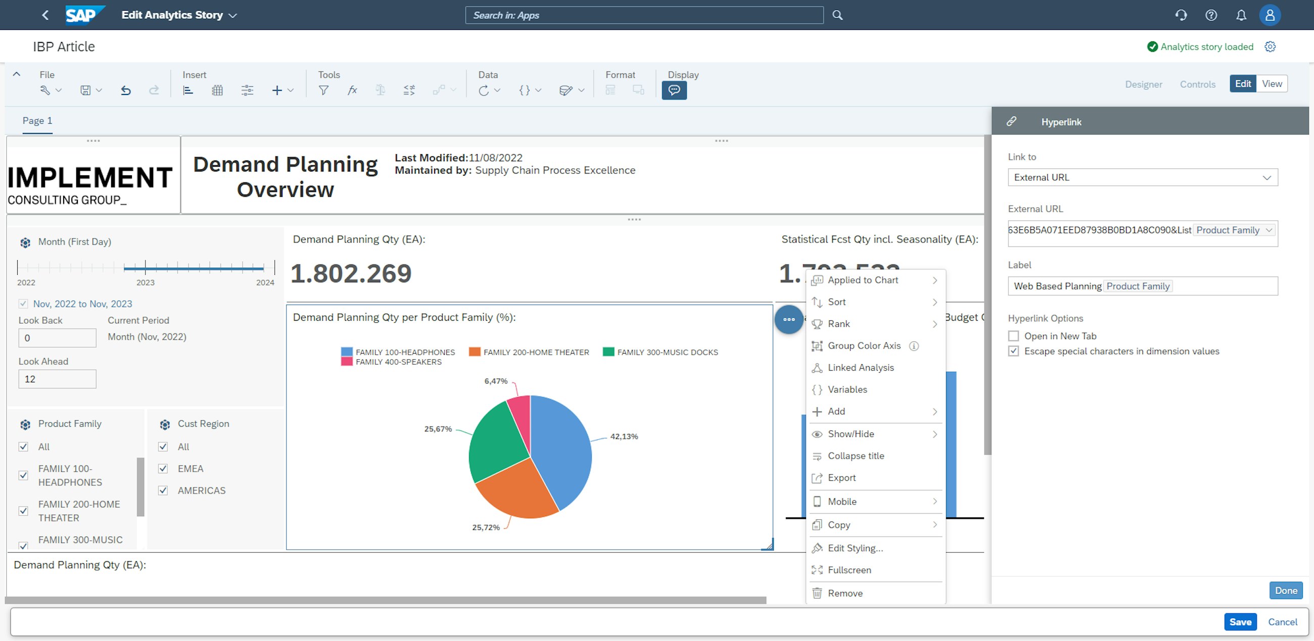
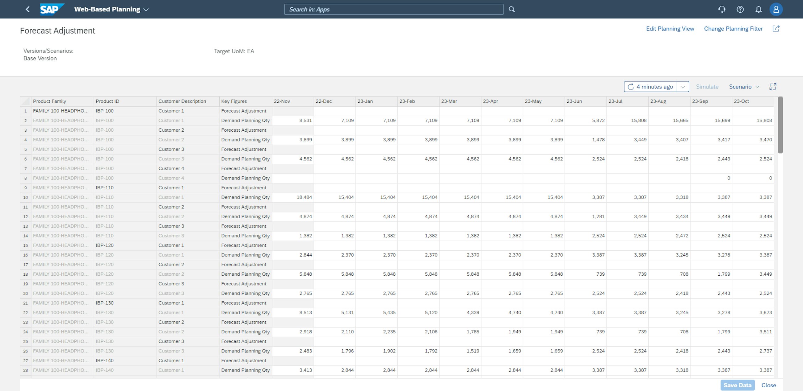
A very cool feature of the Manage Analytics Stories app is the ability to freely link charts to other analytics stories or systems. By going to the edit mode and clicking the 3 dots next to the chart you want to add a link to, you can add external URLs or links to other analytics stores. In the example below, an external URL is added, leading to a Web-Based Planning view. In addition to adding the URL to the external application, it is also necessary to add a label for the hyperlink in this step.
After adding the hyperlink to the specific chart from the analytics stories, it is now possible to navigate directly to the linked Web-Based Planning view.
The possibility of linking your dashboards to planning apps essentially enables the creation of high-level insightful dashboards, from which planners are able to draw actionable conclusions and perform changes with just a few clicks. The distance between the helicopter perspective overview and operational planner adjustments has thus been significantly reduced.
For businesses working in several planning areas, a new functionality is enabled in the Manage Analytics Stories app, which is the ability to link several planning areas to the same analytics story. With this, it is possible to perform analysis across business lines or units or any other intercompany divisions that are planning in different planning areas. The option to link planning areas is enabled by clicking the symbol highlighted below and pressing Add New Data Source.
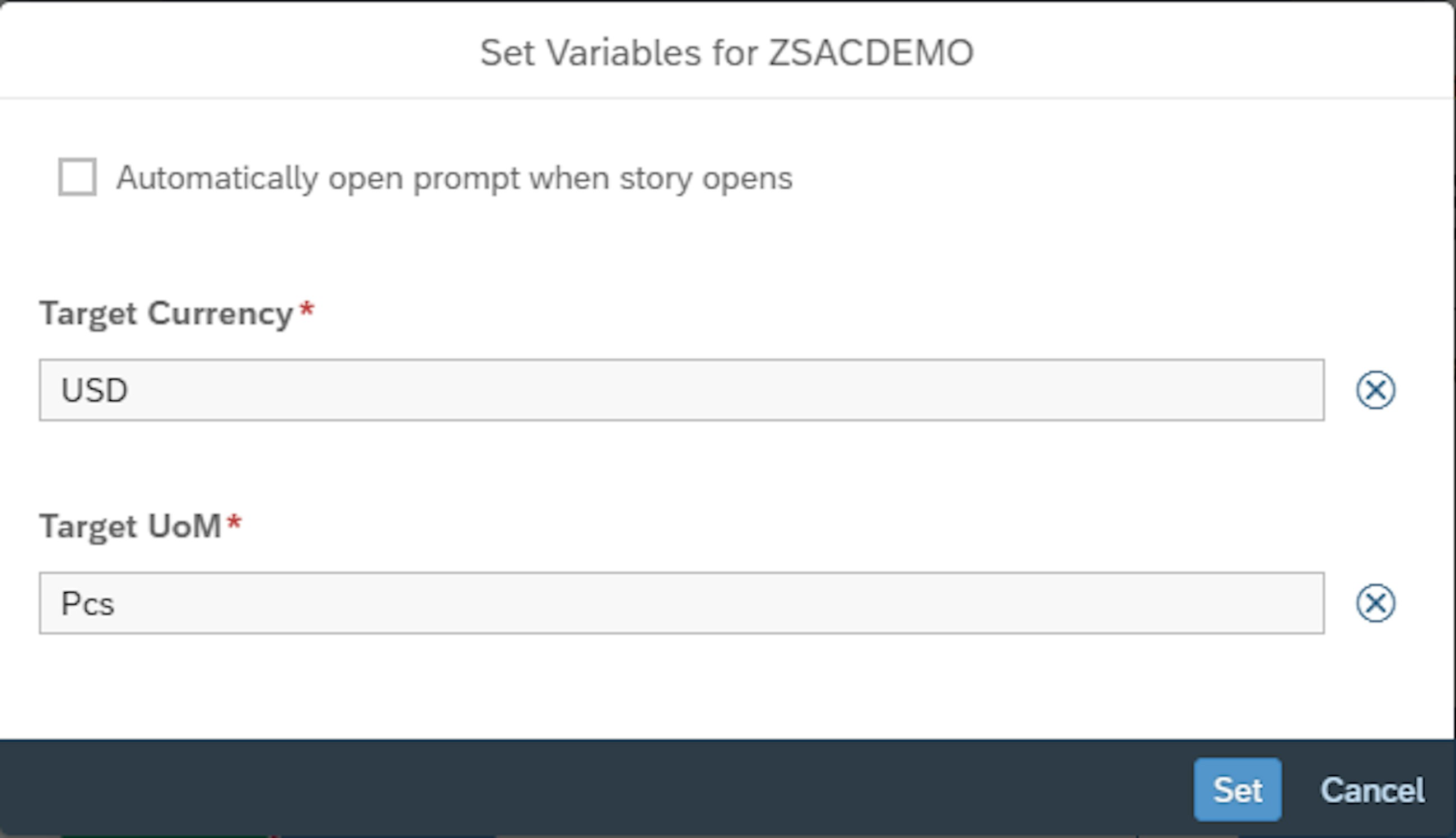
After adding the additional planning area as the new data source, the target currency and the target unit of measure must be selected. Here, USD and units are chosen, and the planning area is now added as a data source to the story.
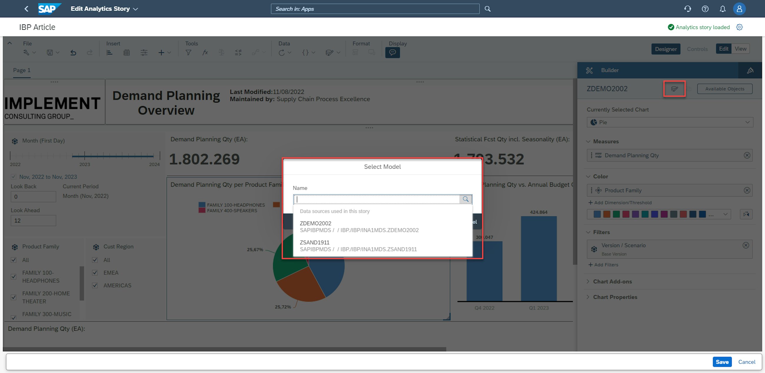
After this, the user can go into Designer mode and click the data model button, which enables the selection of the considered data source.
From an analytical standpoint, this feature in Manage Analytics Stories is extremely useful when consolidating data and generating a helicopter view of several planning entities.
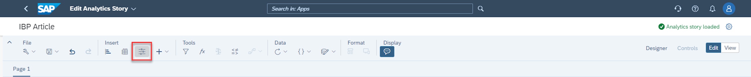
The ability to utilise input controls to analyse data is another very strong feature in Manage Analytics Stories. In brief, it enables the user to do instant simulations by adjusting specific inputs to supply chain planning. When you want to add an input control, select the chart type on the Insert part of the Manage Analytics Stories ribbon.
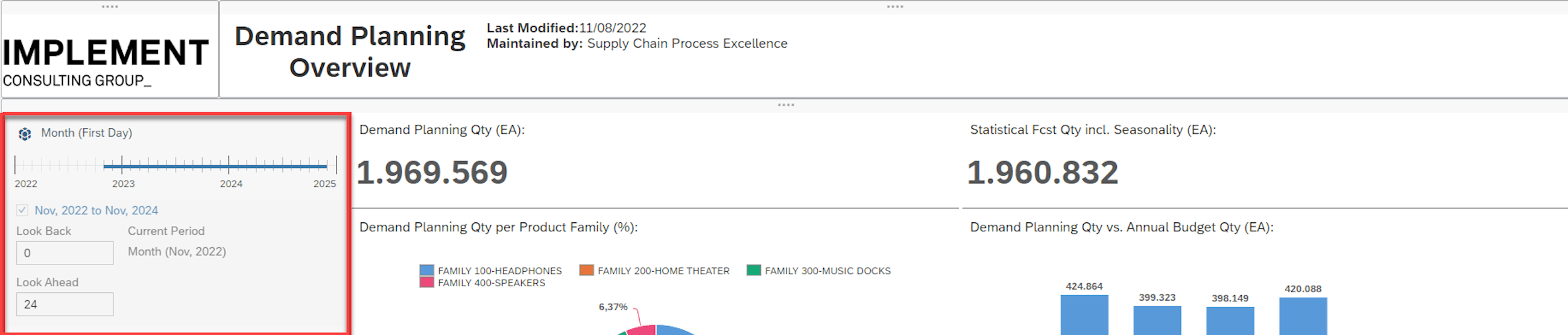
This enables the addition of input controls that can be edited in various ways. In the example below, the period that is considered in the charts can be selected and changed according to the requirements.
Other input controls could be more directly linked to the content. In general, the use of sliders and controls is an extremely strong tool for instantly assessing the impact of parameter changes on other key figures.
The final key feature included here is the Calculated Measures functionality, which enables the addition of formulas and calculations directly in the Manage Analytics Stores application.
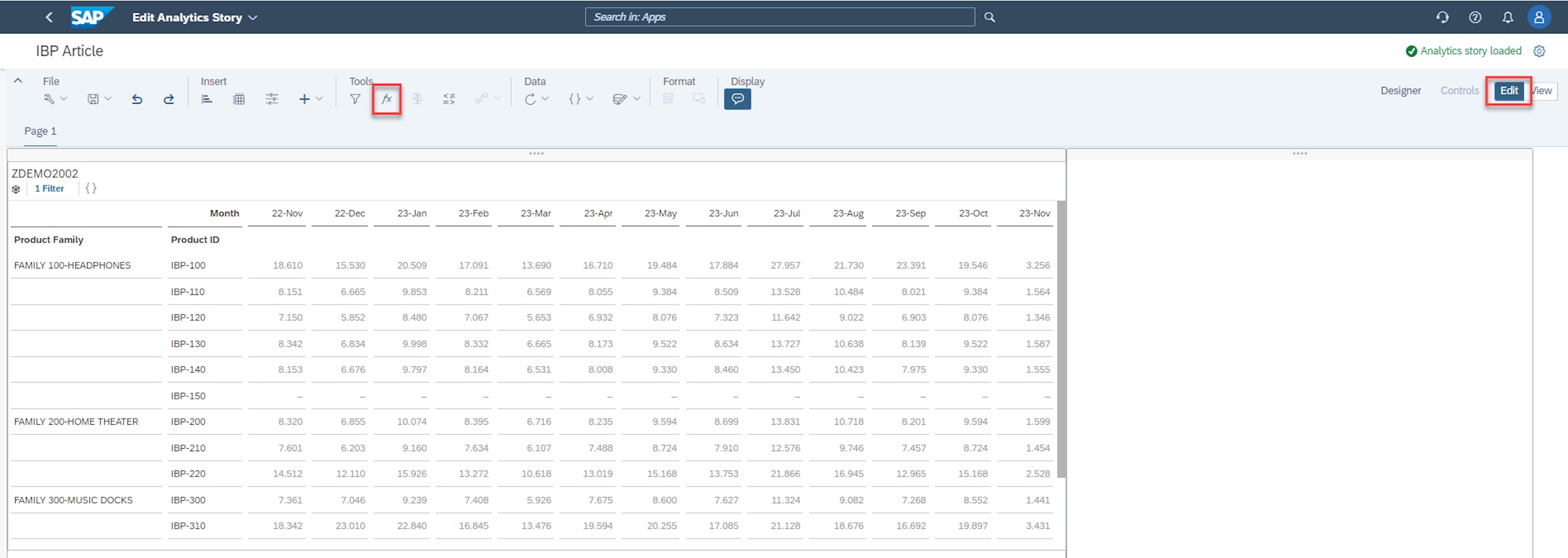
To add a Calculated Measure, the user must go to edit and add a table containing the data to which the Calculated Measures will be applied. Afterwards, the user simply clicks on the function, e.g. symbol.
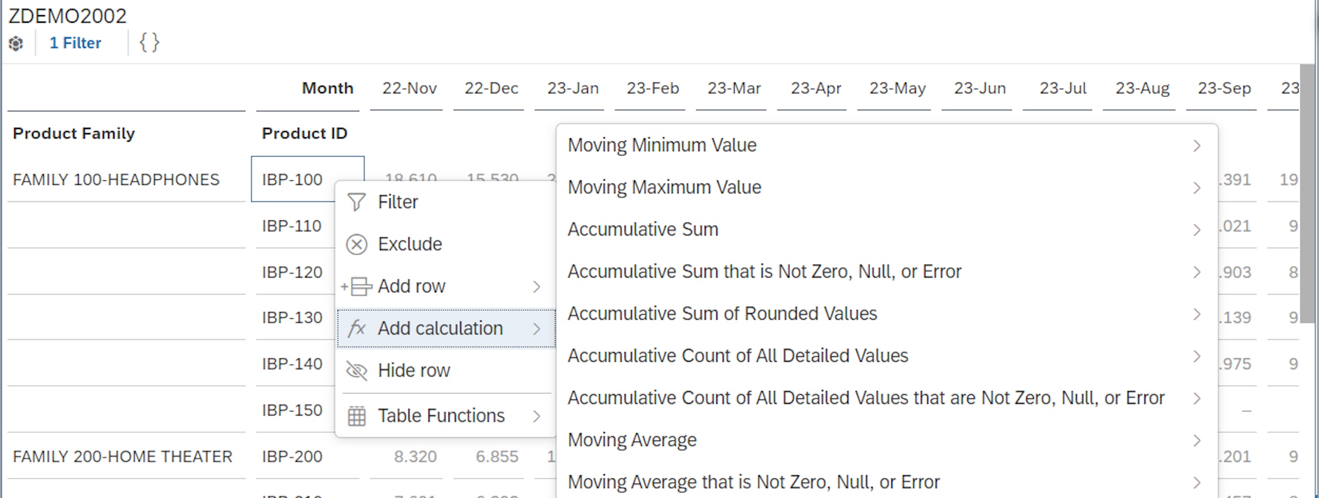
There are two options for adding Calculated Measures in the Manage Analytics Stories app. The first one is to simply right-click on the row or column where the user would like to add the measure. In this option, a predefined set of formulas can be applied, as shown below.
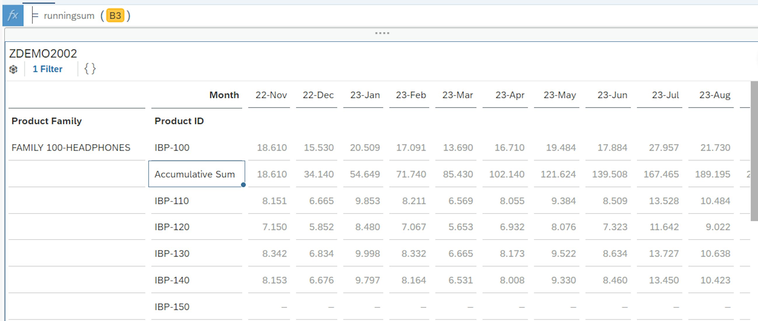
In this case, the Accumulative Sum is selected, and the results are immediately displayed in the table. The applied formula, in this case running sum, is also visible in the formula bar, which you can find at the very top of the screenshot below.
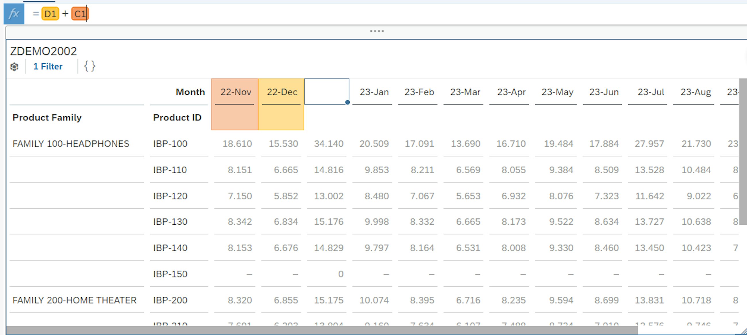
The other option is to add your own formulas to the formula bar and apply these to the desired cells from the data table. To do this, a blank column or row is inserted and selected. The formula, in this case 22-Nov + 22 Dec, is inserted into this blank column, after which it is immediately displayed as a calculation column in the table.
The Calculated Measure feature enables faster creation of charts, and it is no longer necessary to configure key figures in order to be able to get a visualisation of the desired data. This allows users to perform ad hoc spontaneous analyses that will potentially bring unexpected insights to the awareness of interested stakeholders.
At Implement Consulting Group, we will be hosting an informative session on the functionality and usability of Manage Analytics Stories – so stay tuned and keep your eyes on Implement’s website and LinkedIn profile!